 BIRDINPAGE
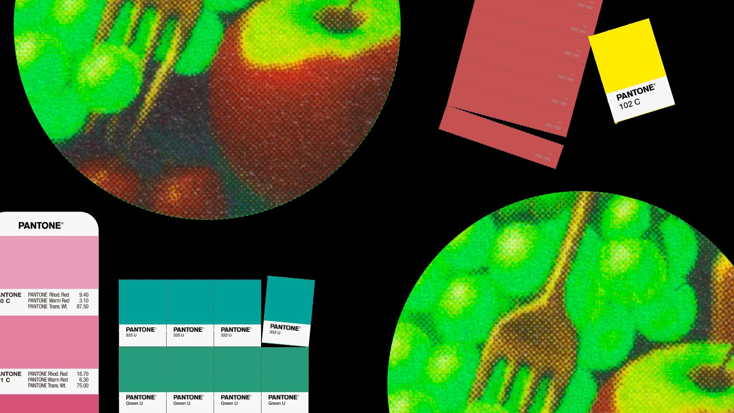

Let's properly learn about spot color printing.
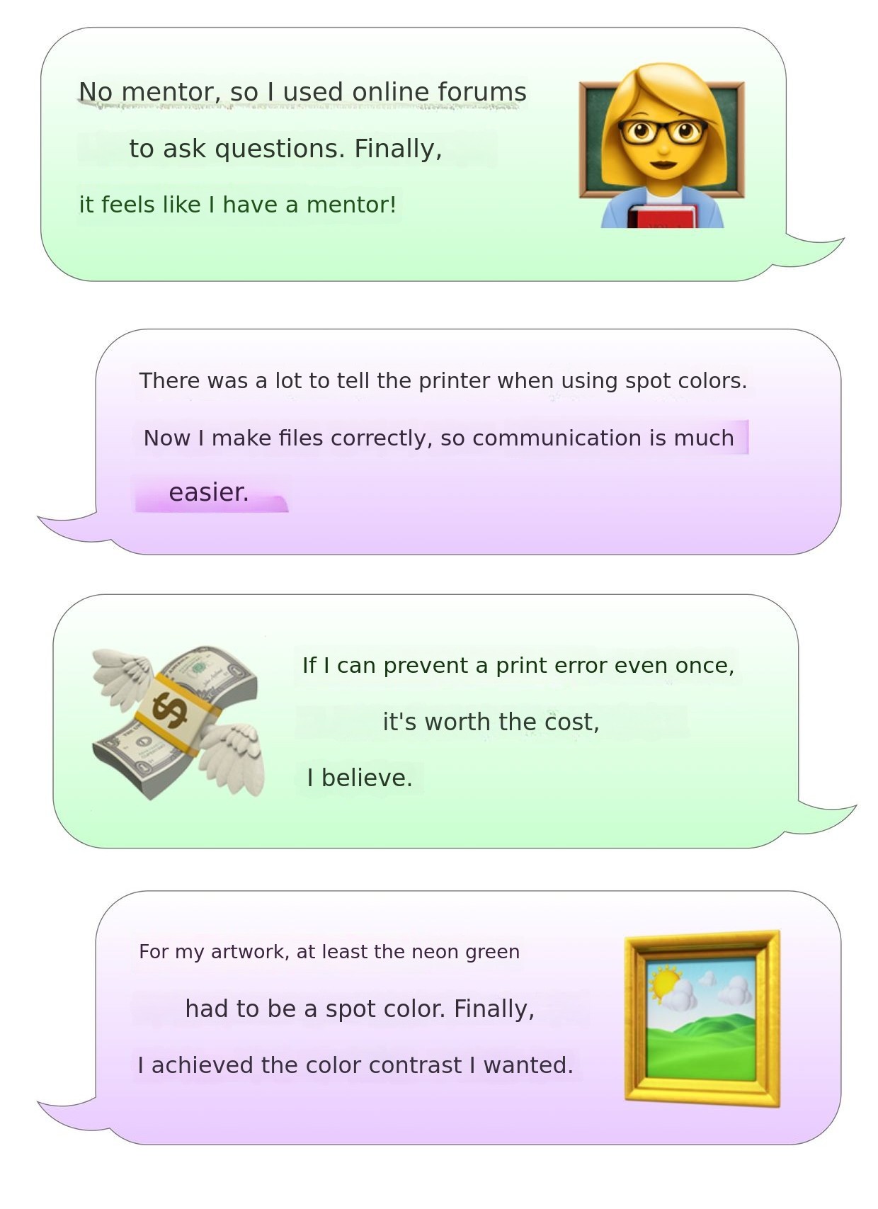
When I was a printing novice, one day I got a call from the print shop. They suggested it would be better to convert the file to spot color. Back then, without a mentor, everything was difficult and unfamiliar to me. I searched the internet, called the print shop, and even after editing the file, I was anxious about whether it was done correctly. When I became quite familiar with printing work, I faced another problem.If I could change the fluorescent yellow-green part of the cover illustration to a spot color, it would print much more beautifully, but I had no idea how to do it.
No one properly teaches printing work anywhere, and even books about printing only explain spot colors in a few pages. On the internet, only basic information that everyone knows is repeated, and sometimes there is even incorrect information mixed in.Is printing know-how something you always have to learn by trial and error on site?
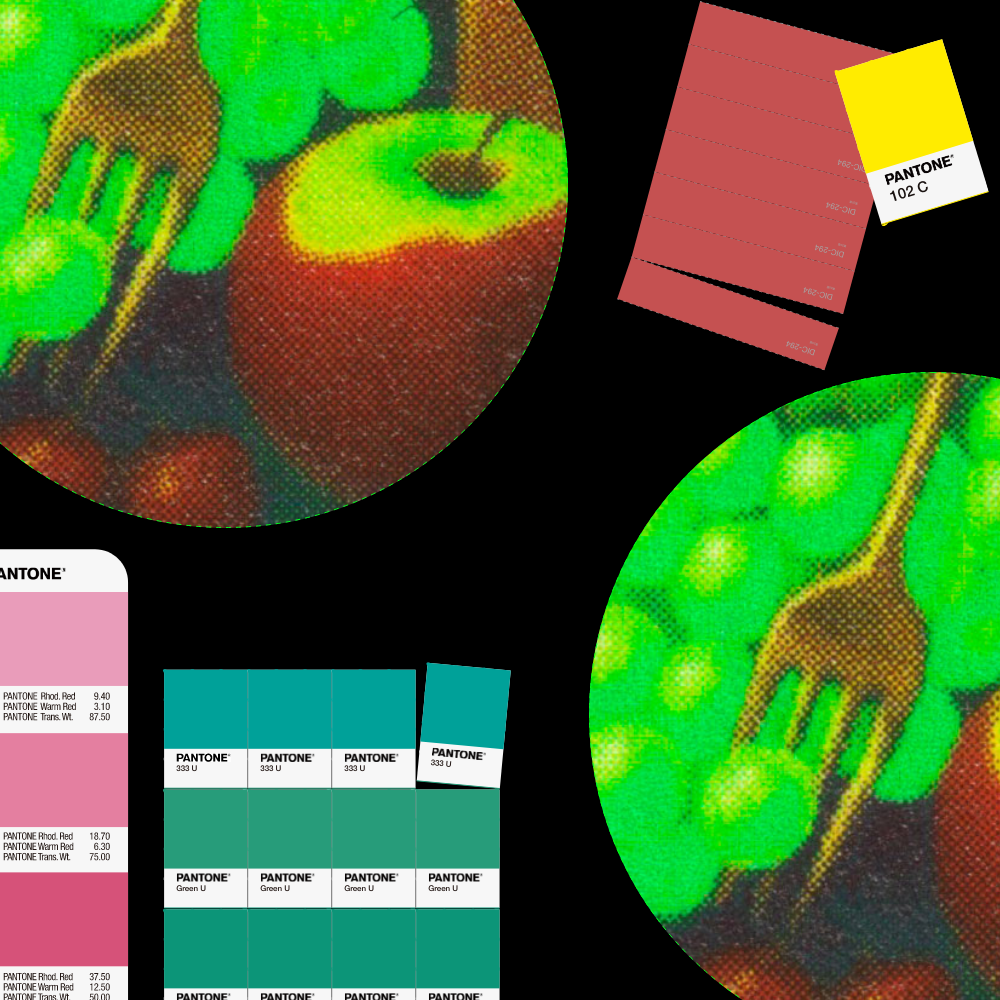
A Practical Guide to Spot Color Printing That Expands Boundaries
From beginners to professionalsA spot color printing guide for everyone It covers a wide range from the basics to the application of spot colors. It aims to provide answers for everyone, from complete beginners, designers who want to add impact to images, illustrators who want to preserve the clarity of the colors or paints they used, to professionals considering the use of spot colors.
The book consists ofa sample section and an explanation section. As you turn the pages, you can intuitively understand why spot colors are used, while also gaining practical knowledge and know-how to use spot colors properly.
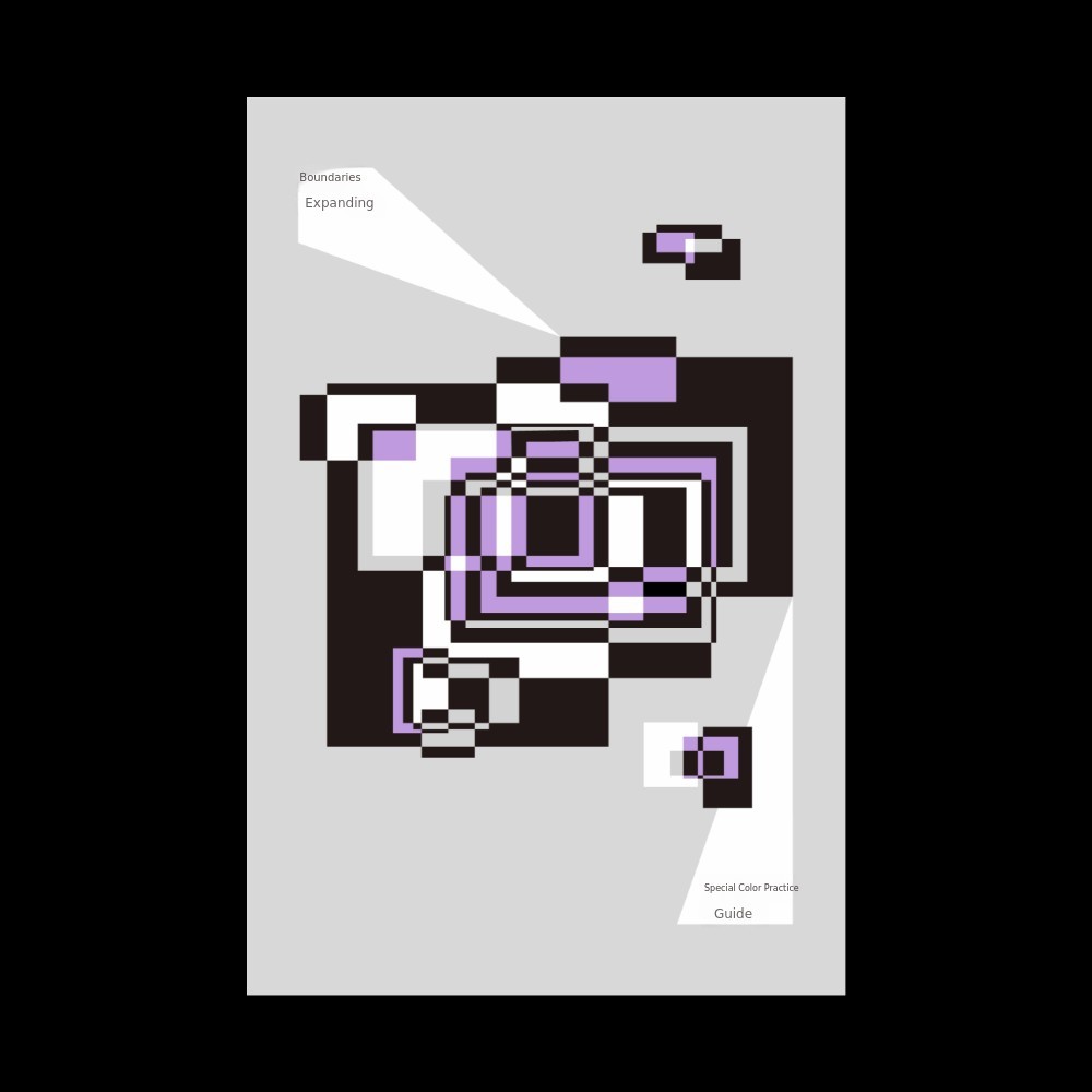

In addition to CMYK, the sample imagesare produced by adding three spot colors: fluorescent green, pastel purple, and silver spot color. To use spot colors effectively, everyone involved—clients and team members—must share a proper understanding of spot colors. Seeing the actual samples is much more effective than a hundred words, so we have prepared sample images that use spot colors in various ways.
Some spot colors shine much brighter than on a monitor, and some have a unique matte texture. If you place a silver spot color bitmap image on a black background, it creates a strong impact. There are also things to watch out for. When using spot colors in different concentrations (%), you should not use 100% and 80% together. Both may look similar and be hard to distinguish. The reason for this is also covered in the explanation section.
In the explanation section,the entire process is discussed, from understanding spot color printing, creating and editing files, to printing. It is also connected to the sample image section. It explains how to create the sample images shown in the previous section and what to be careful about.
Design forms to avoid that cause printing errors, essential points to check when requesting spot color printing, unexpected special properties of some inks when choosing spot colors, how to determine spot color standards affordably, how to order spot color ink instead of mixing it, preserving original colors using spot color separation programs, editing spot color files directly in PDF, supervising spot color printed materials, and more.A variety of practical know-how that is hard to find anywhere else. is included.
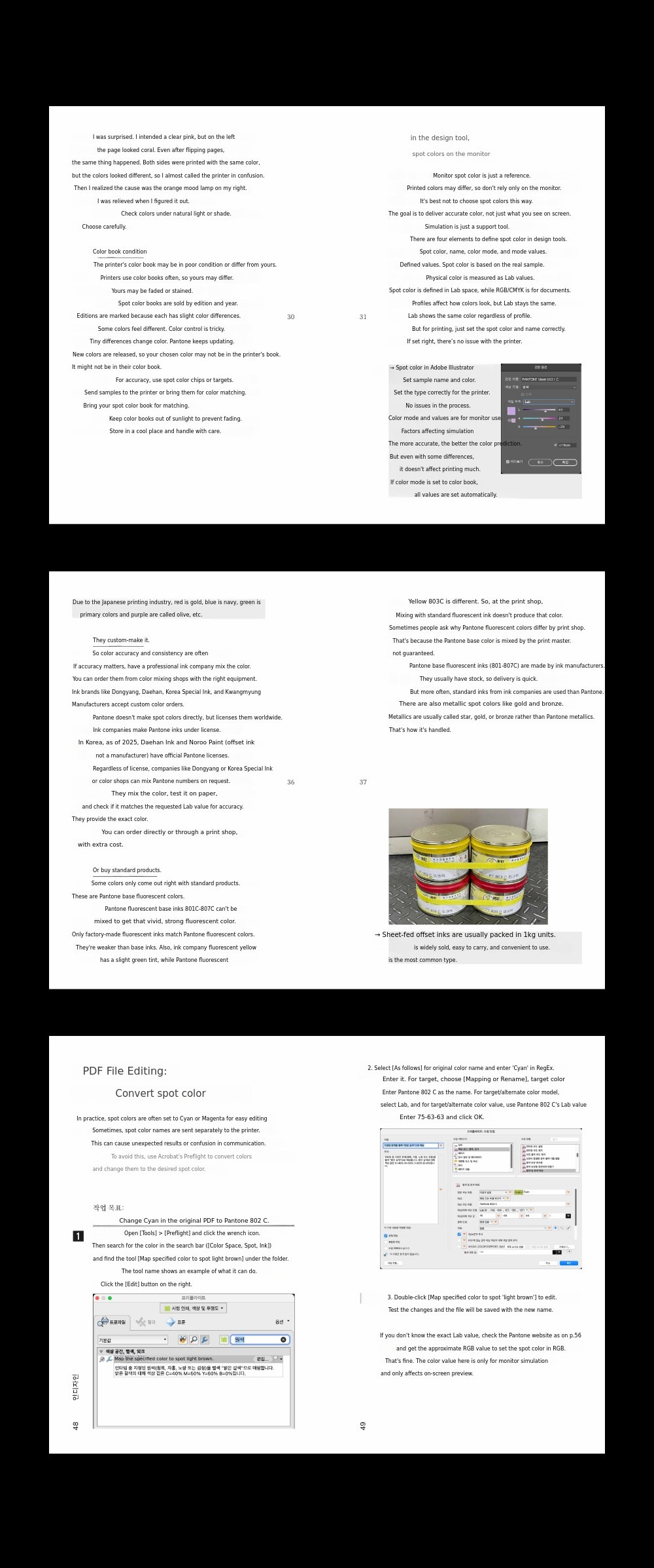
For those who want to create even better results.
Hello, we are Bird in Page, exploring printing and creating printing guidebooks to make things better. Over the past eight years, we have produced two printing sample books and two spot color guides, communicating with about 30,000 readers.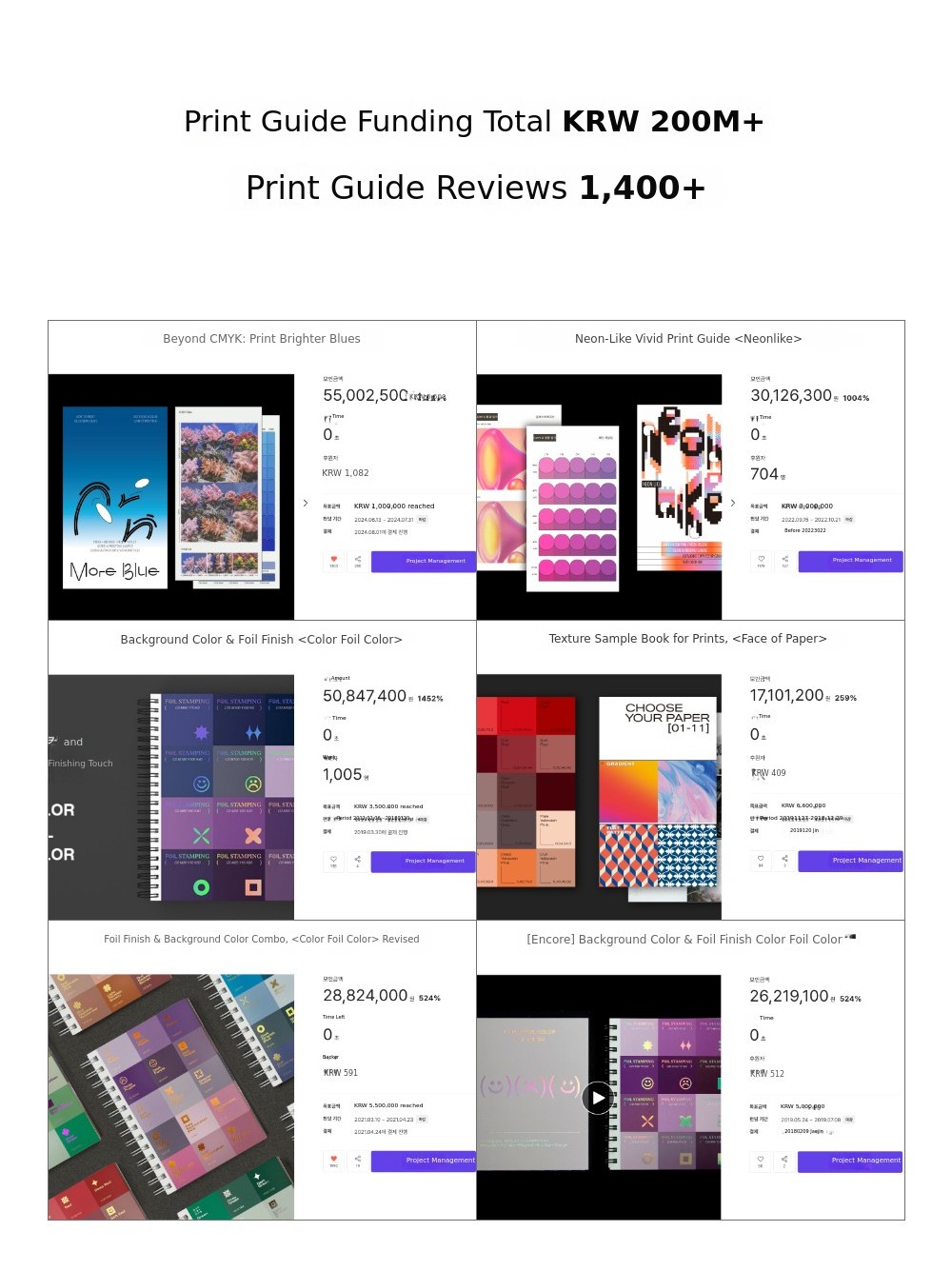
The new spot color guide began with the questions we received. From which Pantone book to buy, how to choose a print shop, why the spot color I printed looks different from the CMYK color in the book, to why the print shop asks to recreate the spot color file. Facing countless questions, we planned a new book as the answer. Whenever there was something we didn't know, we checked directly with print shops and ink manufacturers, printed spot color samples, and accumulated experience and information by working with design programs.
Bird in Page'sthird andmost comprehensive spot color practical guide is introduced.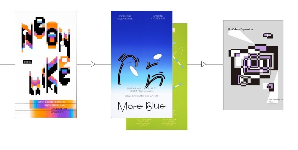
- Creating vivid images with fluorescent spot colors
《Neon Like》 - Making images more true to the original by adding OGV spot colors
《More Blue》 - From the basics of spot color, to practical use and applications
《A Practical Guide to Expanding the Boundaries of Spot Color》

It starts with understanding printing.
You need to understand printing to deeply understand spot colors. On screen, colors appear as numerical values, but in reality, they are the physical result of ink layered on paper. In the book,it begins with an in-depth explanation of printing.
Why don't the colors I set appear on print as they do on my monitor? What does it mean when CMYK colors are unstable? What exactly is the role of a print profile? You need to be able to answer these questions accurately to fully understand spot colors.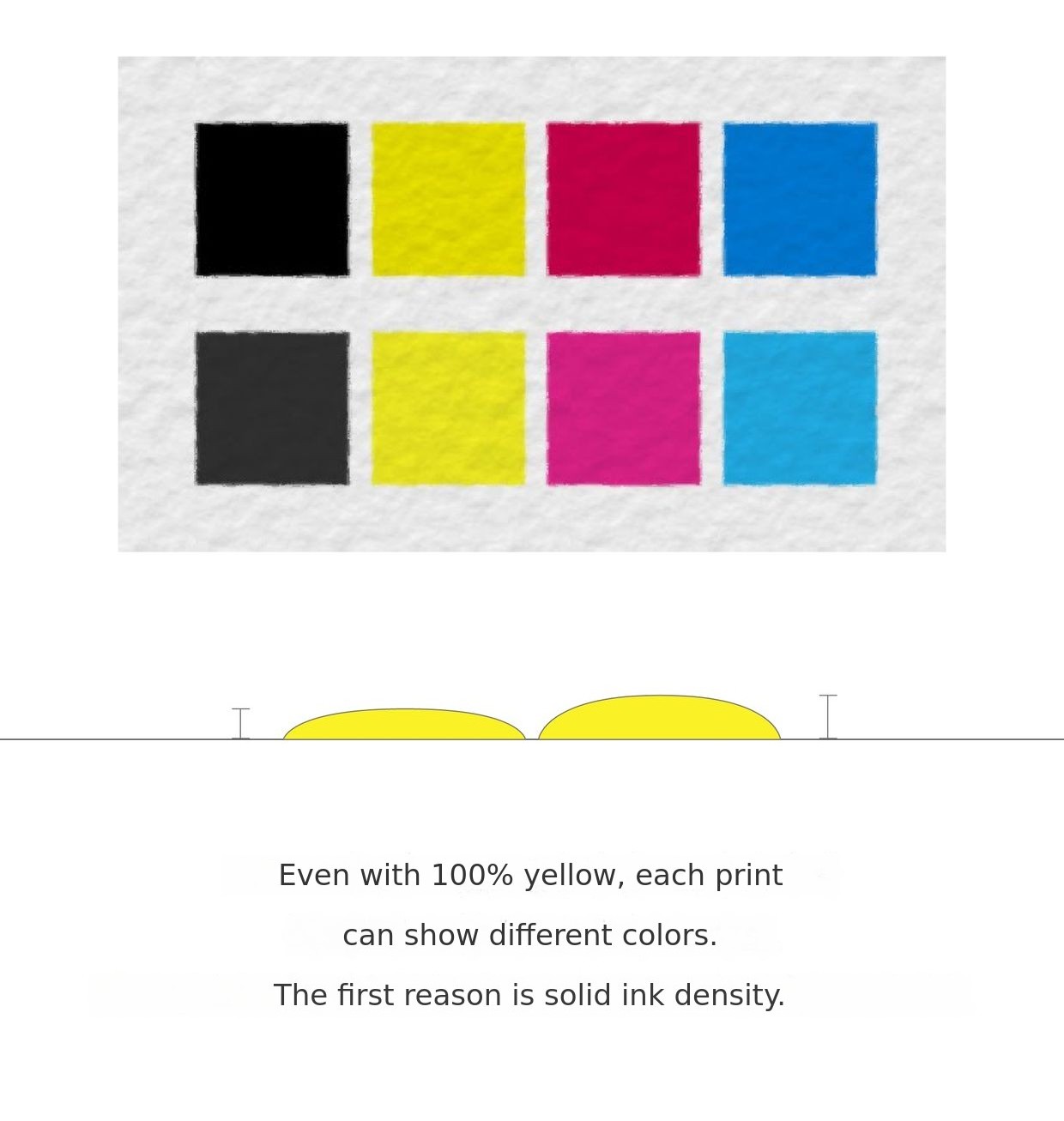 By understanding the printing process, you can anticipate potential issues and respond accordingly. You may have a general idea, but not know the reasons behind it.By explaining the principles of printing, we help beginners understand the overall printing process and spot color printing.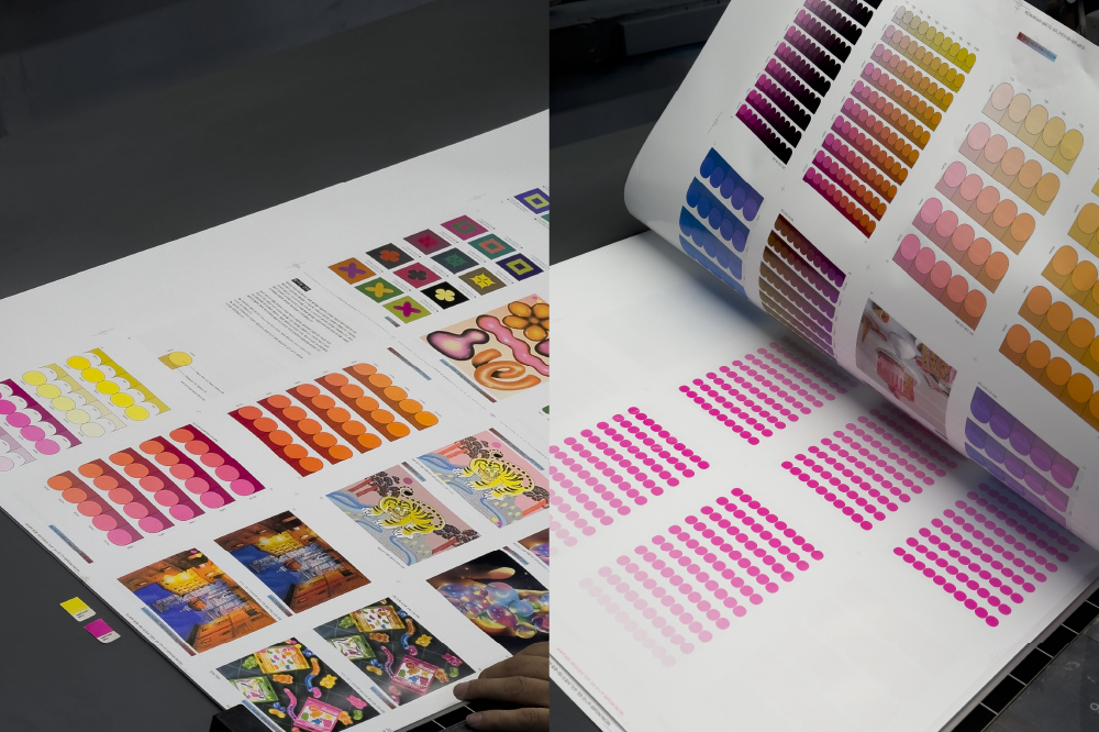
Every step of spot color practice
We carefully explain everything from the basic concepts of spot colors to practical usage methods so that even beginners can easily understand. From how to use a spot color book, to properly creating files, communicating with the print shop, and actual print production, we cover all aspects related to spot color practice.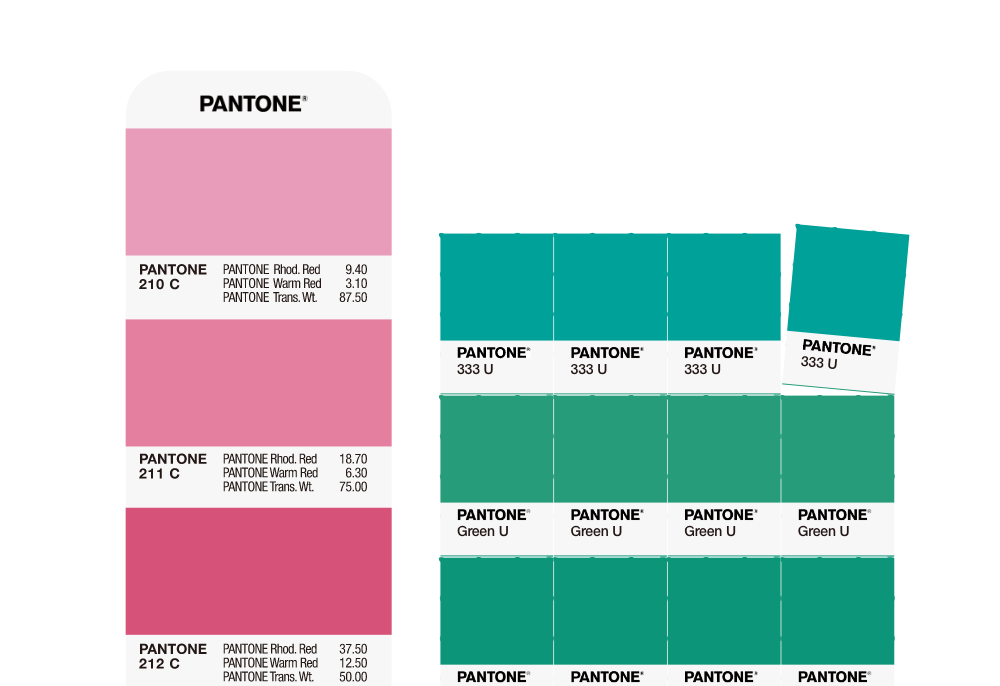
Since spot colors are not used every time, even professionals can get confused during work. In such cases, we provide reliable guidelines to help you create and edit files correctly.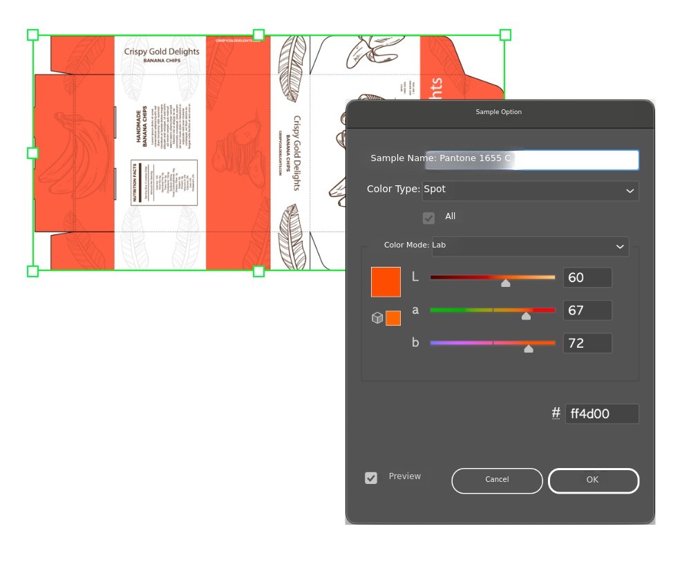 The book covers various practical topics such as image creation methods and sample images for two-color printing, how to directly edit spot colors in the final PDF file, and how to proof printed materials.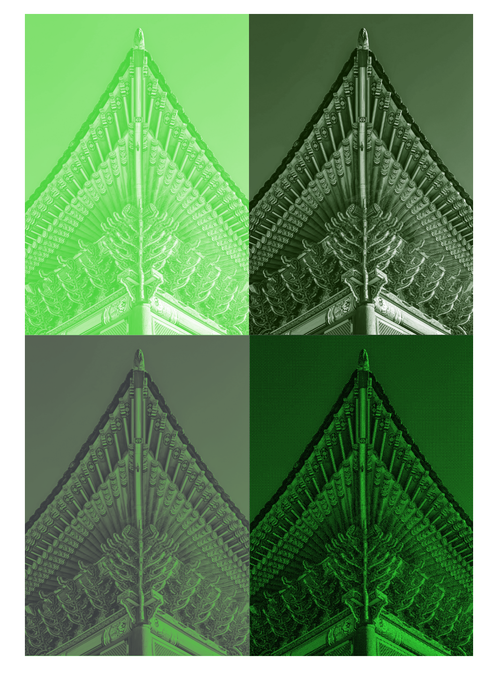
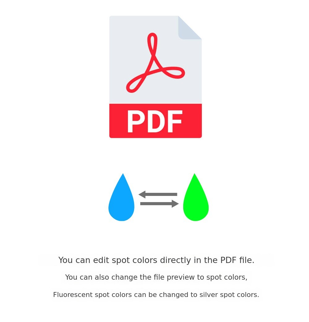
Spot color image creation methods,More details
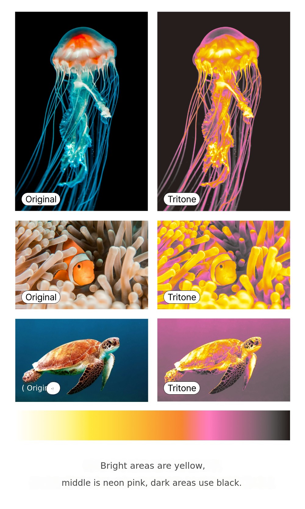
How should you proceed when you want to create a striking impression by applying spot colors to vibrant gradients or photo-like images? What should you be careful about?
Generally, when converting images to spot colors, the spot color is applied after converting to black and white. As a result, all original color data is lost. In the book,We cover methods for creating color images that preserve the original colors as spot colors using various techniques, including free separation programs. One of the programs works only on Mac, but we also introduce a Windows-compatible program with the same functionality.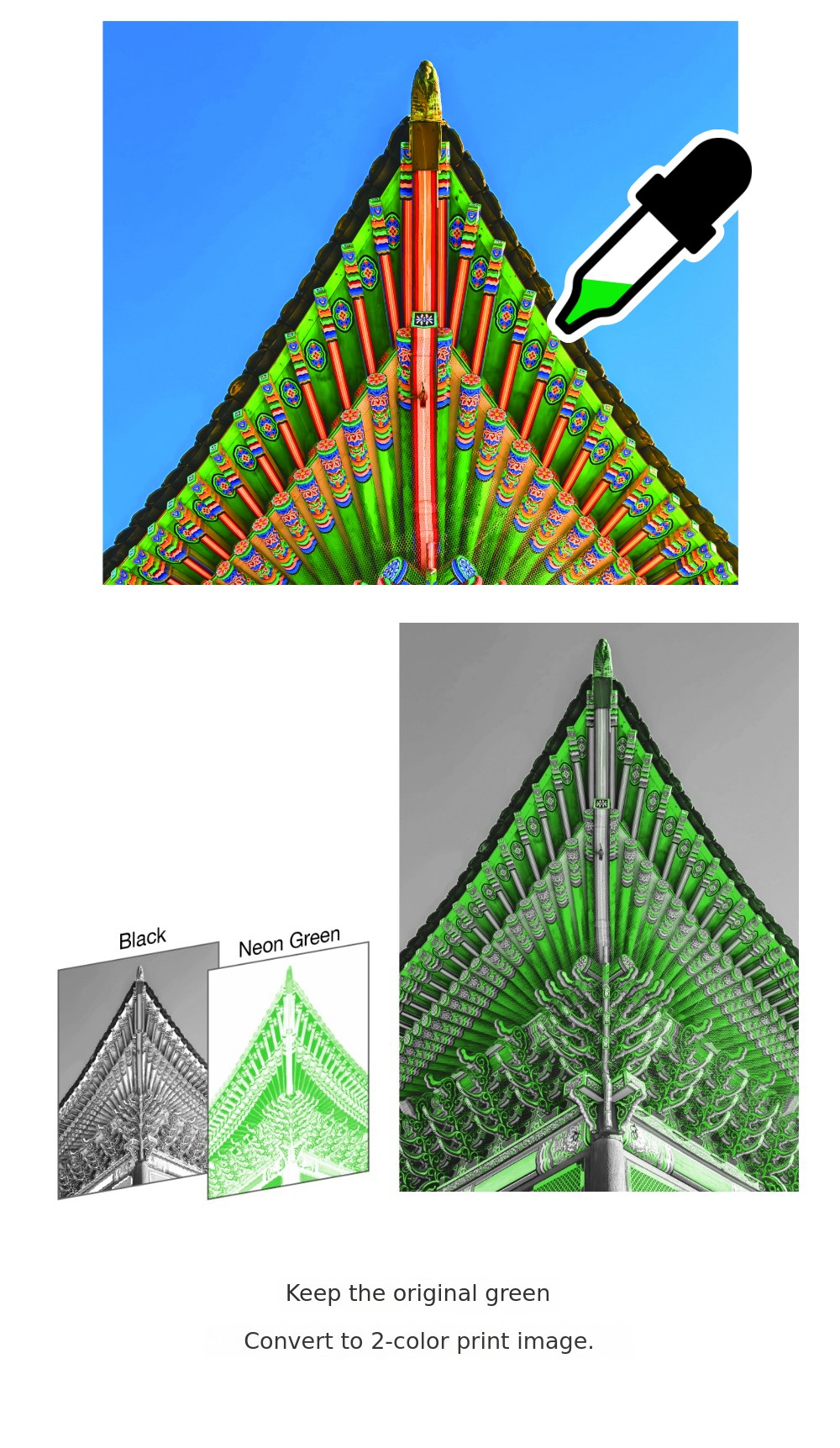 Do you need to edit images to create a two-color comic book? The book introduces the easiest and most perfect method.
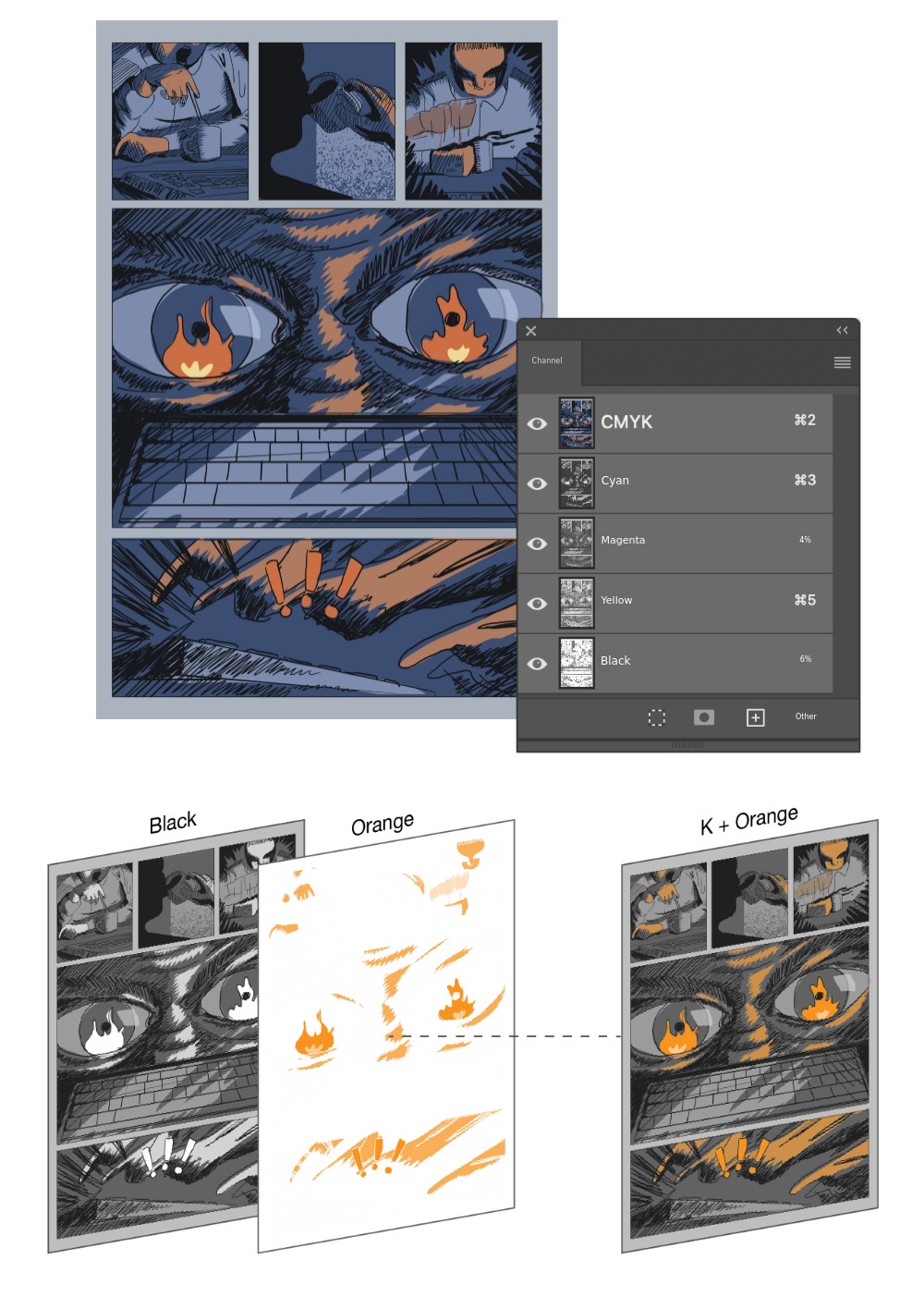 Image separation methods play an important role not only in two-color books but also in package production. For example, how can you assign spot colors to product photos on a folding carton package?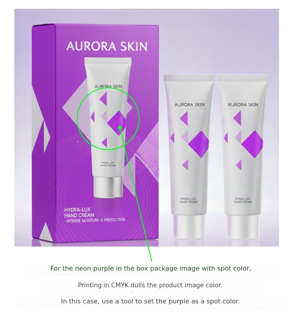
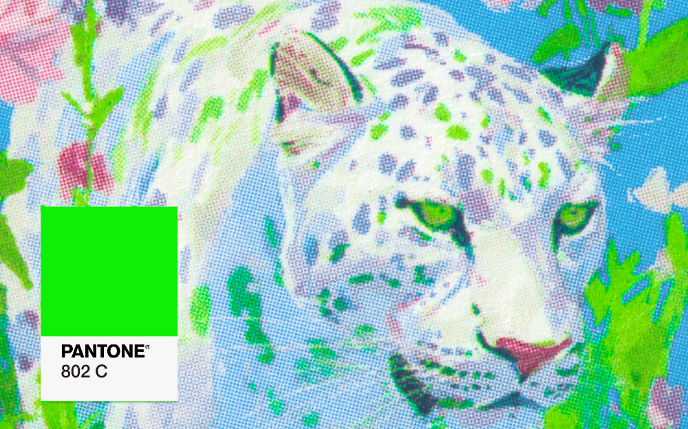
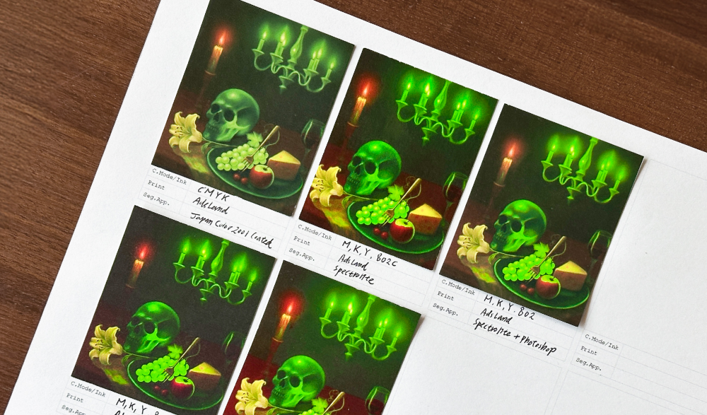
Not only for two colors,It is also possible to create color images that emphasize unique colors with spot colors. In the example, fluorescent green was used, but you can create images with any spot color.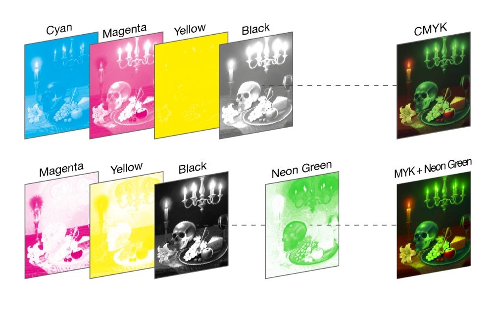
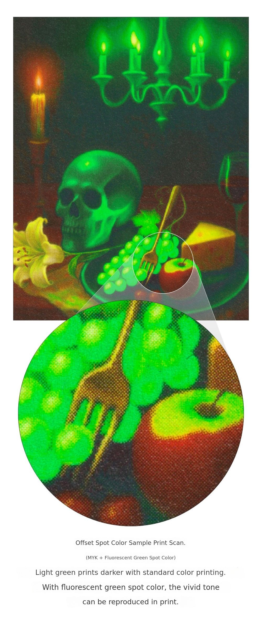 The book includes various methods for creating impactful results with spot colors, such as separating spot color areas of an image into bitmaps or separating by tone.
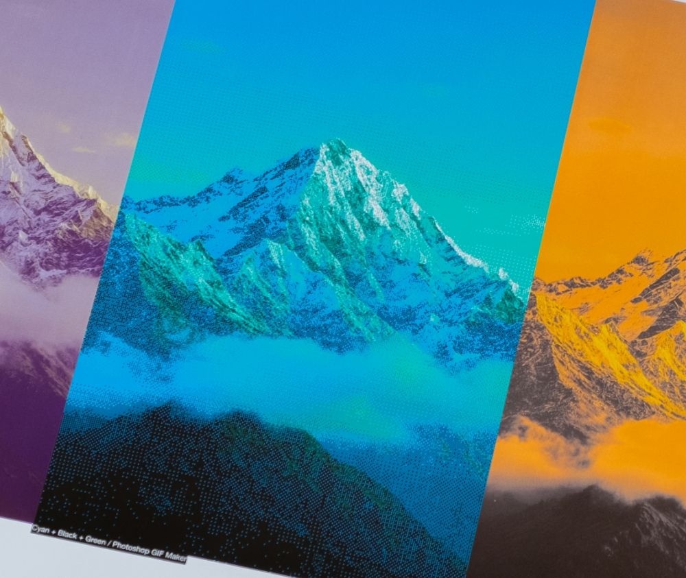
In spot color usage,Provides criteria.
Are you wondering whether you should use spot colors in your project? This book offers criteria to help you determine whether the color you want can only be achieved with spot colors, or if using spot colors would be more advantageous in terms of cost or preventing printing errors.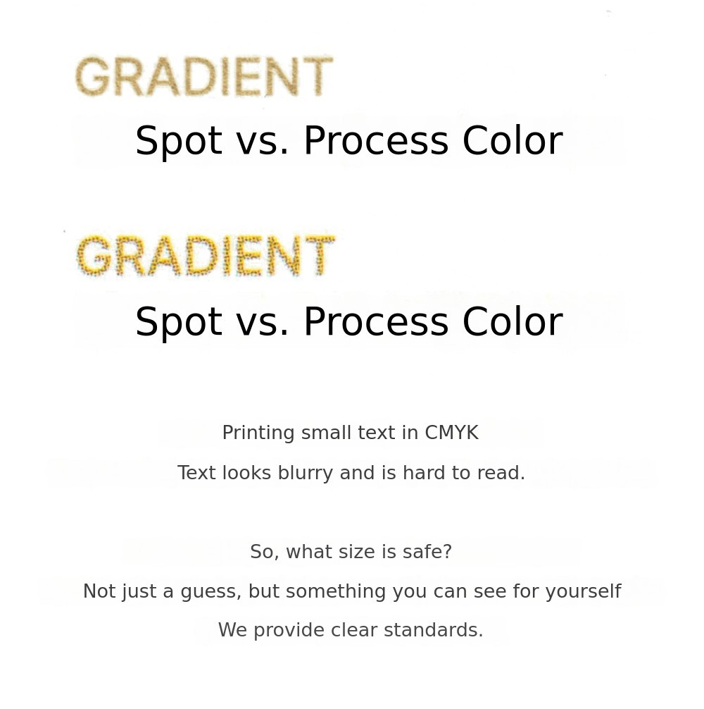 When used appropriately, spot colors can actually be a choice that reduces costs. If your material can be printed with just two inks, there is no need to pay extra to use all four CMYK inks. If you are unsure about using spot colors, open this book right away!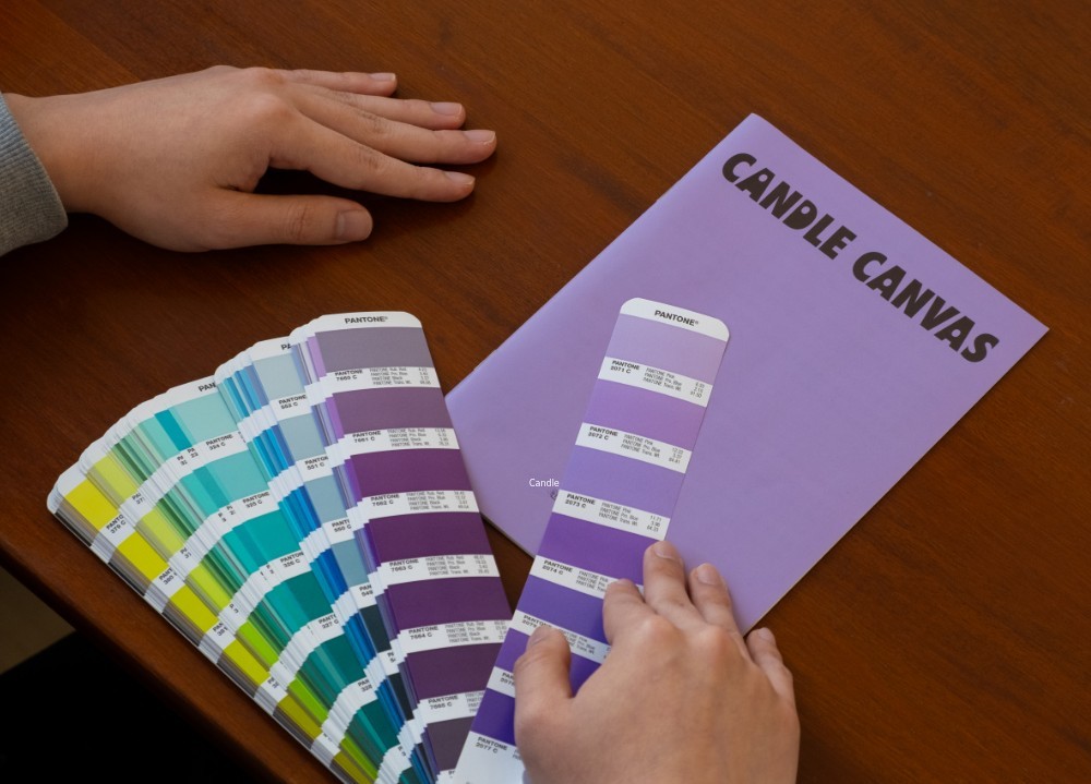
References with diverse uses of spot colors.
When working on design projects, you naturally accumulate physical references. Since it is difficult to accurately judge color or texture on a monitor alone,the process of checking actual printed materials is essential. In order tocommunicate based on a shared understanding with team members or clients, a variety of spot color references is a must.
In this book, the necessary references for considering spot colors are printed using spot colors. You can immediately check the color and material properties by simply opening the book, without the hassle of collecting samples or searching and comparing them when needed. Since decisions and sharing are based on physical samples, the workflow becomes much faster and more accurate.
Additionally,the printing files and final printed samples are provided together, allowing you to directly compare the expected colors at the file stage with the actual results.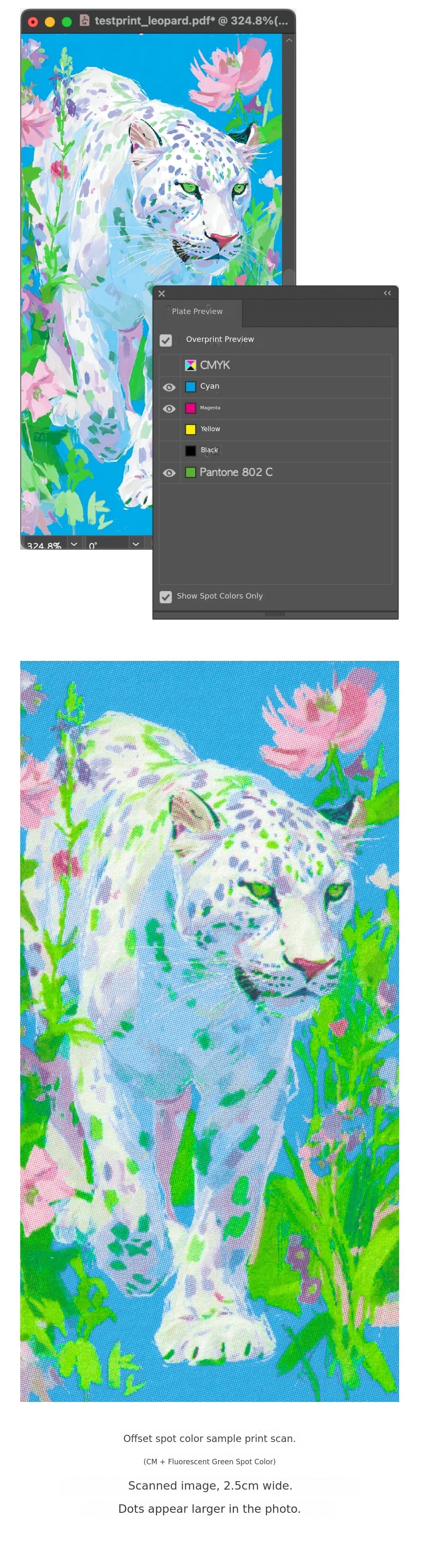
Learn more about the book.
Sample section.
Through the sample section, which is printed using three spot colors along with CMYK, you can directly experience the feel of spot color prints. By naturally flipping through the pages, even beginners can intuitively understand spot colors and use this understanding for communication. The sample section makes up about a quarter of the book.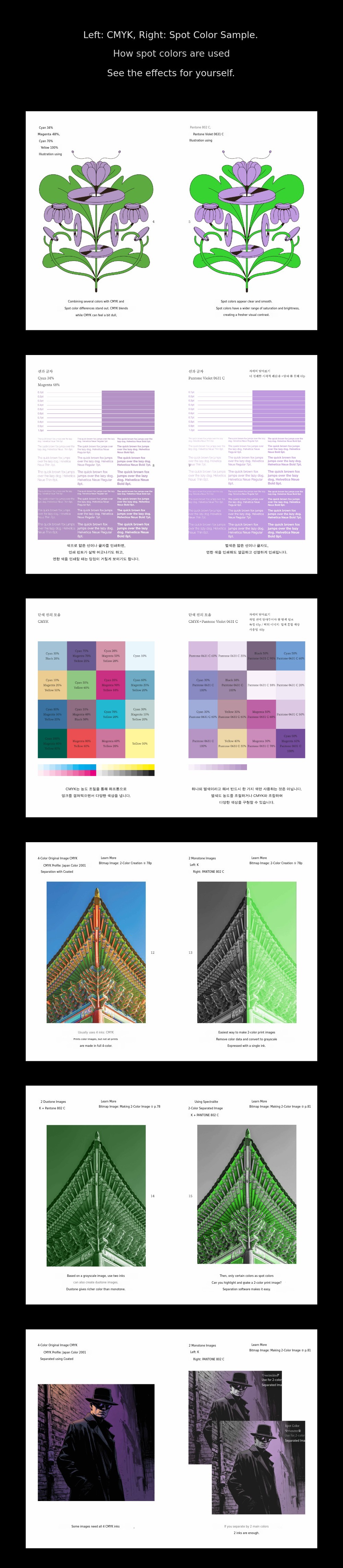
Explanation section.
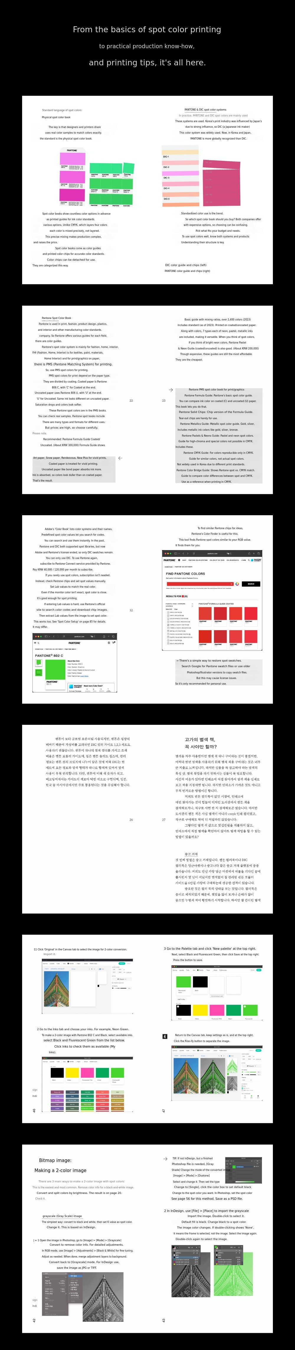
The explanation section covers everything from the basics of printing to applying spot color printing in practice. It contains detailed knowledge and know-how needed for creating and editing spot color files, as well as practical information required at printing and press inspection sites.
+α Digital Sample Package
This package includes the duotone image setting files covered in the book, along with the separated original spot color image files.
The duotone setting files can be used immediately in practice by simply changing the colors. By checking the separated original data on your monitor and comparing it with the printed results, you can intuitively understand how the on-screen simulation of spot color images differs from the actual print effect.
"A guide that goes one step further has always been lacking."
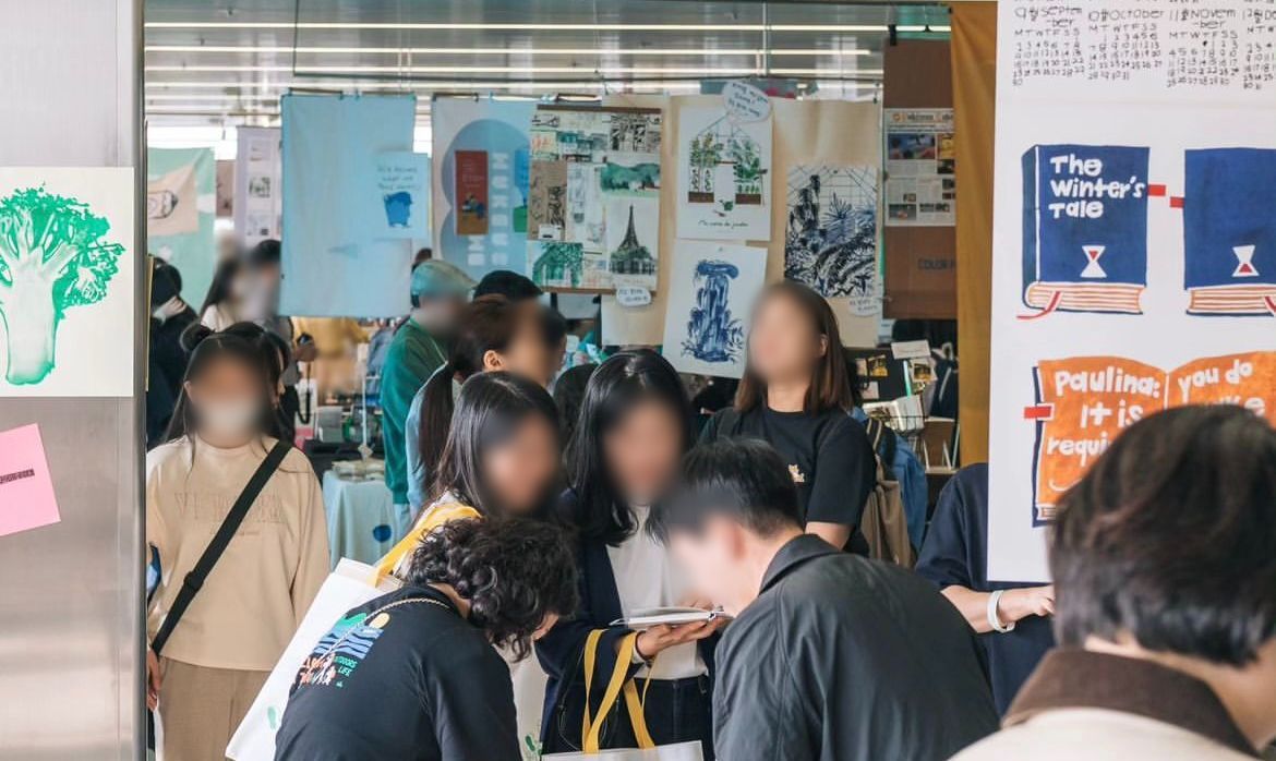
Over the past few years, we have published spot color printing guidebooks such as "More Blue" and "Neon Like." While creating these books, we collaborated with print shops and conducted several spot color printings, accumulating trial and error, and at the same time, received various questions about spot colors from our readers.
From these experiences, we realized three main things. First, spot colors present many challenges for designers during actual use. Second, many professionals attempt spot color printing after feeling its necessity, even without sufficient understanding of printing and spot colors. Lastly, it is difficult to find high-quality, in-depth information about spot colors both online and in books.
In practice, using spot colors often raises many questions, and it was common to have to ask directly in online communities, print shops, or even ink manufacturers. Looking back, as a beginner in printing, the more I researched and worked, the more questions I had, which made me anxious. There was an abundance of basic explanations everywhere, but it was hard to find information that went a step further.
Moreover, when looking at questions and answers posted in online communities, there were often inaccurate or overly definitive statements that only added to the confusion. There were also many cases where people insisted something was impossible, even though alternative solutions existed.
Through these experiences, we strongly felt the need for systematically organized materials, and planned this spot color practical guide to comprehensively cover everything from basics to applications, allowing you to check the results with your own eyes.
Questions and Answers
Q: How is this different from the previous spot color guides, "Neon Like" and "More Blue"?
A: The fluorescent spot color guide "Neon Like" and the 7-color printing guide "More Blue" focus on special image production methods that go beyond basic spot color usage. "Neon Like" covers how to create unique, highly saturated fluorescent images by replacing magenta and yellow in CMYK with fluorescent spot colors, while "More Blue" introduces ways to express images more broadly and richly using a 7-color profile.
Because these are special spot color applications, those unfamiliar with the basic concepts, standard spot color printing processes, or file editing methods for spot color printing may find them a bit difficult. We received many questions during this process, so we planned this book, the Spot Color Practical Guide, to include basic spot color content for beginners as well as various applications of spot colors not covered in previous books.
If you are new to the spot color guide series,we recommend reading this book first, and then reading "Neon Like" and "More Blue" in order.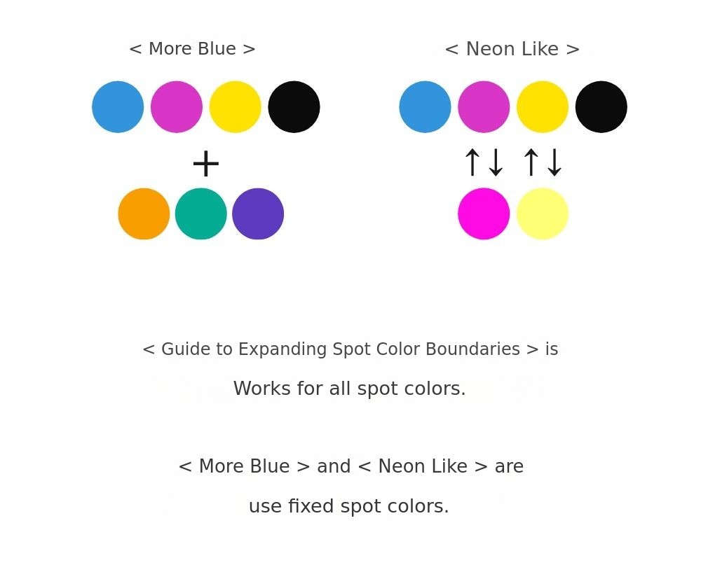
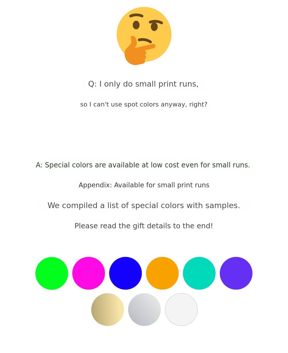
Q: Isn't spot color unusable for those who print in small quantities?
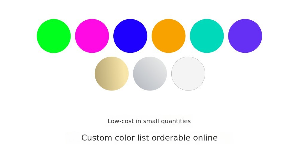
A: Spot colors are generally suitable for mass printing, such as offset printing, due to their characteristics. This is because it is difficult to add the desired spot color directly to digital printers. However, recently, options to add spot colors to digital printing equipment have been emerging. As introduced in "More Blue," options like orange, green, and violet spot colors in Indigo printing, as well as fluorescent pink and silver spot colors, are expanding the choices for using spot colors in digital printing at a lower cost.
In addition, spot color channels are very useful not only for small quantity printing but also when applying post-processing such as foil stamping or epoxy. Therefore, it is beneficial to learn how to handle spot colors in design programs.
Gift Description
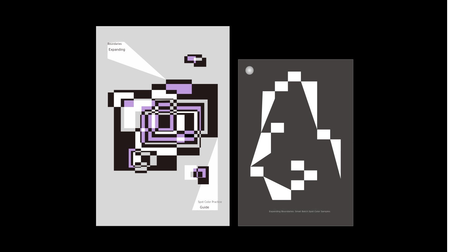
A Practical Guide to Expanding the Boundaries of Spot Colors
120mm X 180mm, sample section uses CMYK + 3 spot colors, exposed thread binding, 212 pages.
The digital sample package consists of ① Photoshop duotone setting file ② separated original spot color image files ③ a chart explaining small-quantity spot color samples.
Supplement: Collection of Small-Quantity Spot Color Print Samples
100mm X 148mm, 10 single-sided sheets, rivet binding.
There are spot color printing options available even in small quantities. You can easily order them online, and we have compiled affordable spot color printing methods for small runs, created samples, and included them as a supplement. It contains explanations, ordering methods, pricing information, and actual printed results for each printing method.
We provide spot color print samples using fluorescent green, fluorescent pink, blue, green, orange, purple, white, silver, and gold spot colors. These are included with the book.
Additional Components
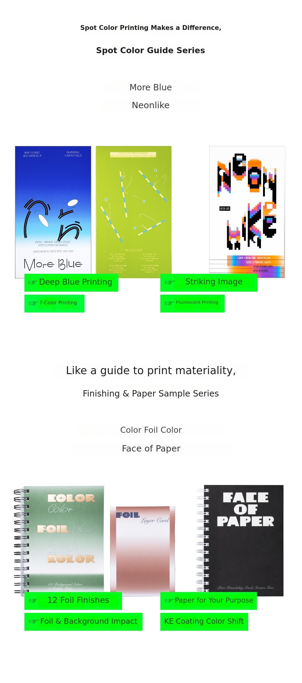
Bird in Page has met tens of thousands of readers through books. Our previous projects—7-Color Printing Guidebook "More Blue," Fluorescent Printing Guidebook "Neon Like," Paper Texture Sample Book "Face of Paper," and Foil Sample Book "Color Foil Color"—are offered together at the lowest price with a 10% discount exclusively on Tumblbug.
Especially for the spot color guide series "More Blue" and "Neon Like," we recommend reading "A Practical Guide to Expanding the Boundaries of Spot Colors" first, then reading these in sequence for a deeper understanding and use of spot colors.
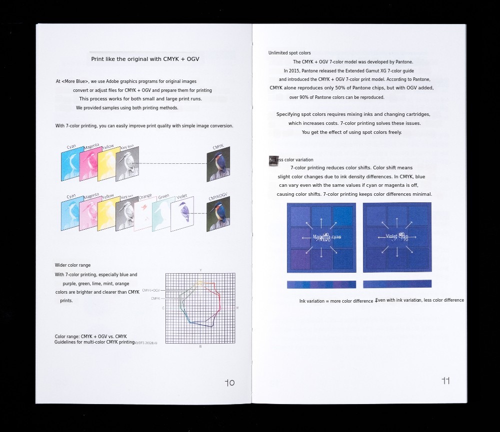
1. Printing Even Bluer Than CMYK: "More Blue"
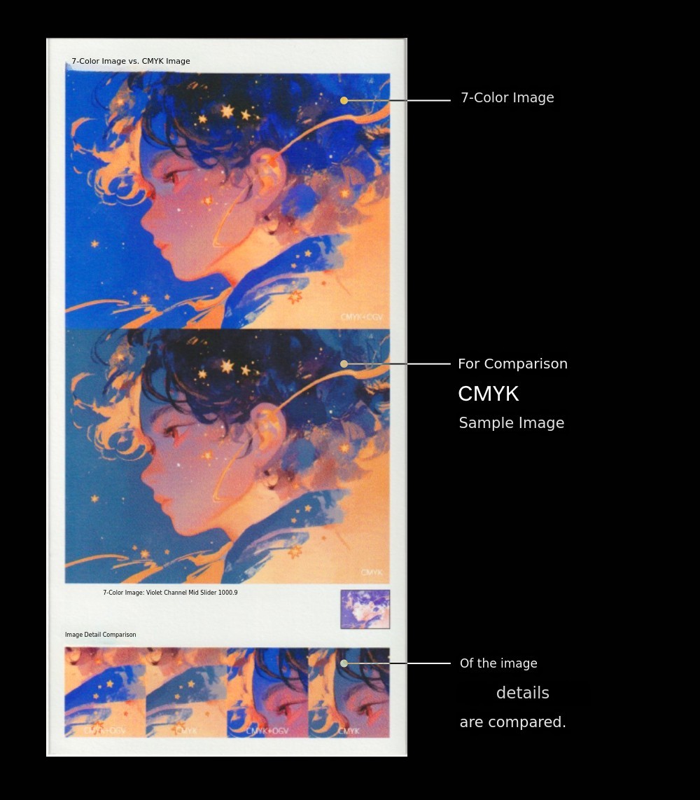
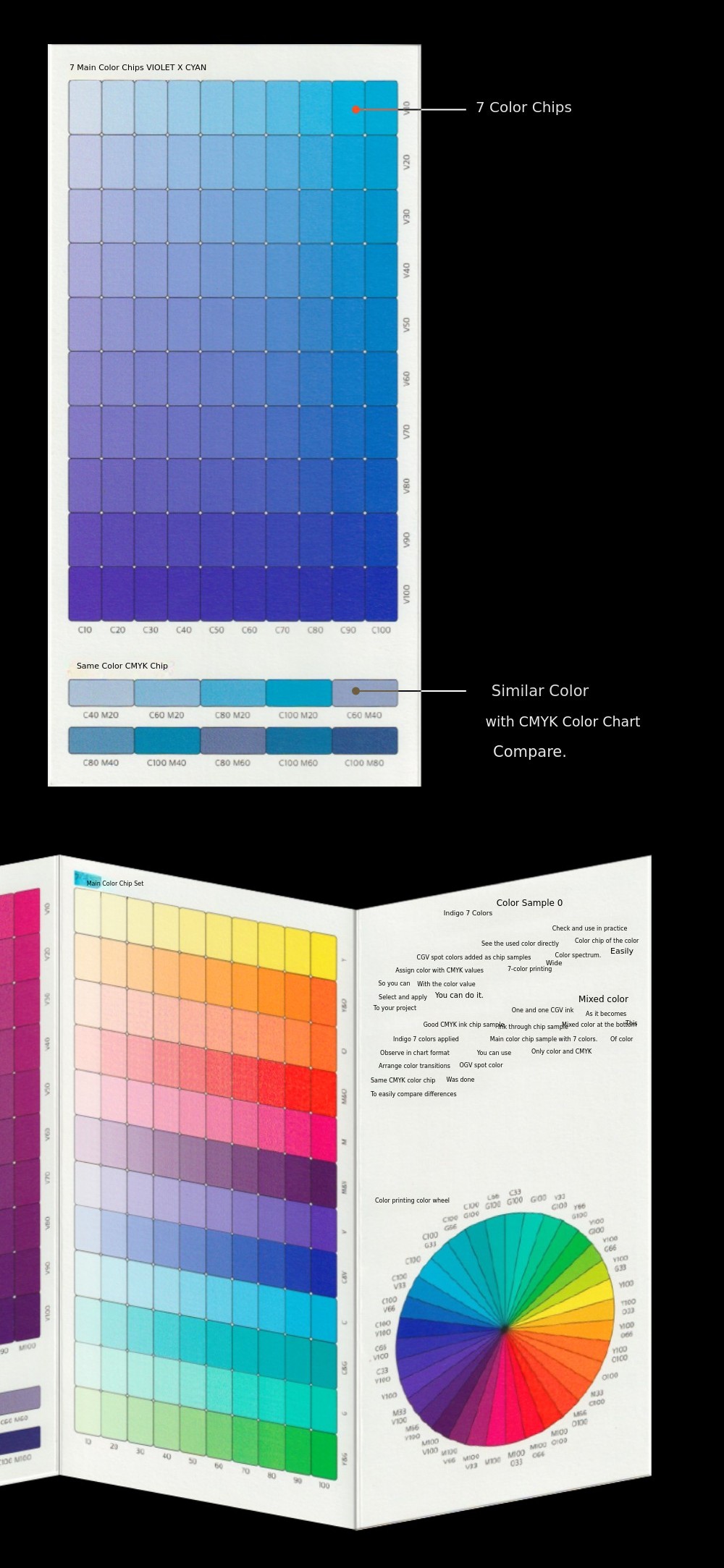
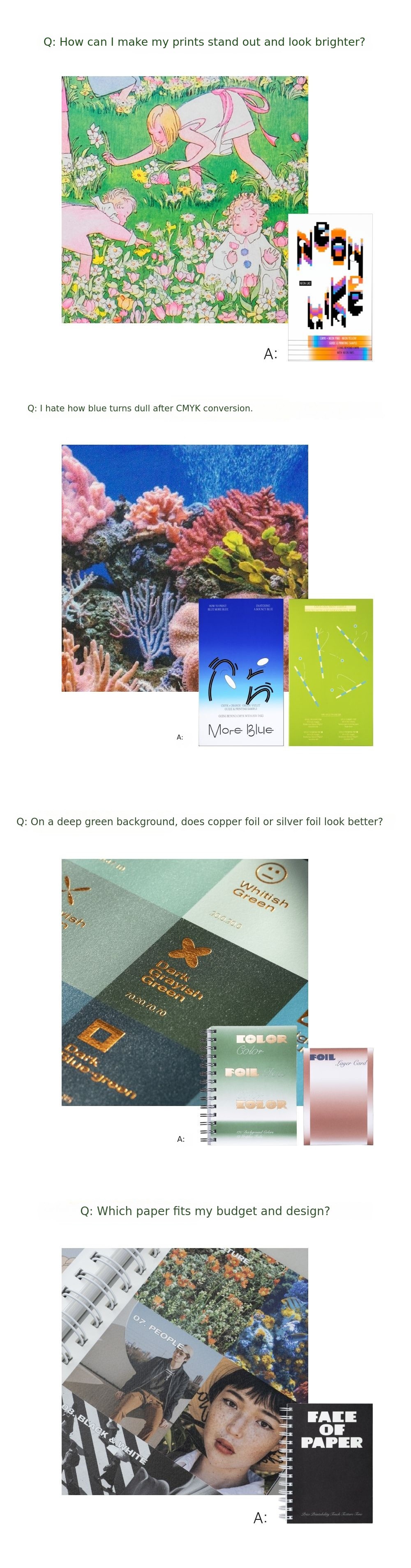
The more you mix inks, the darker they get. That's why some colors inevitably look dull in CMYK. These are secondary colors like blue-violet, red-orange, and green-mint, made by mixing two inks. Blue, in particular, tends to print especially dull for this reason. To express secondary colors vividly and brightly, you should avoid mixing inks and instead add new, high-chroma inks. This is the principle behind 7-color printing, which adds OGV (Orange, Violet, Green) to CMYK. "More Blue" introduces 7-color printing methods suitable for both small and large print runs.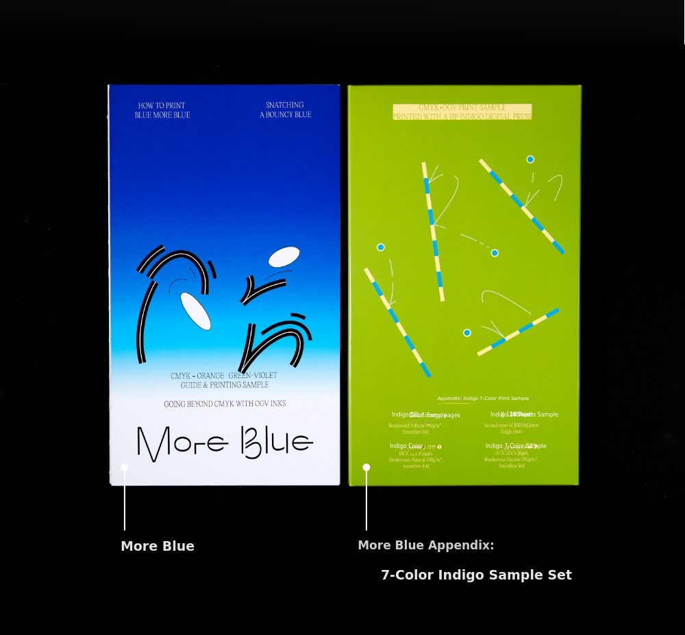
"More Blue" explains not only small-quantity Indigo 7-color printing methods but also spot color printing techniques using 7-color printing in large-scale offset printing, and provides samples.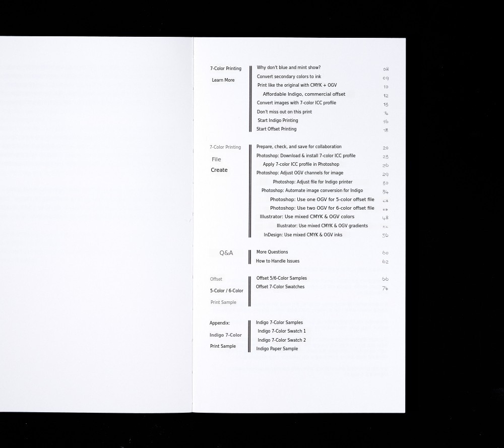
2. Turning on the Backlight in Your Prints"Neon Like"
By using fluorescent spot colors instead of CMYK, your prints can appear as if a backlight is turned on. The secret is to use fluorescent pink and fluorescent yellow in place of CMYK's magenta and yellow. This introduces the magic of making all colors in your print shine like spot colors using fluorescent inks. As with "More Blue," this is a method for achieving vivid colors beyond CMYK.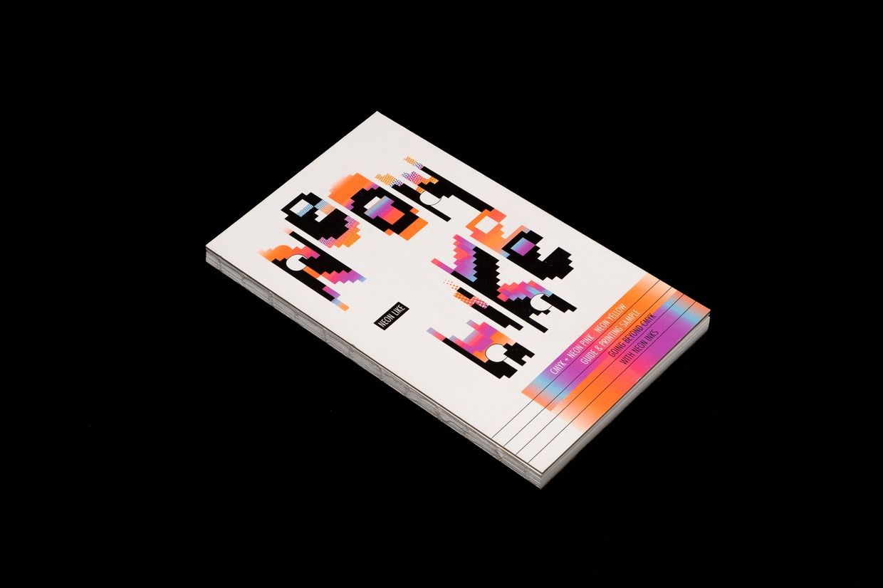
"Neon Like" covers the entire process of printing with fluorescent spot colors, from editing data to print high-chroma images, creating fluorescent spot color plates, to providing actual image samples and color chips.
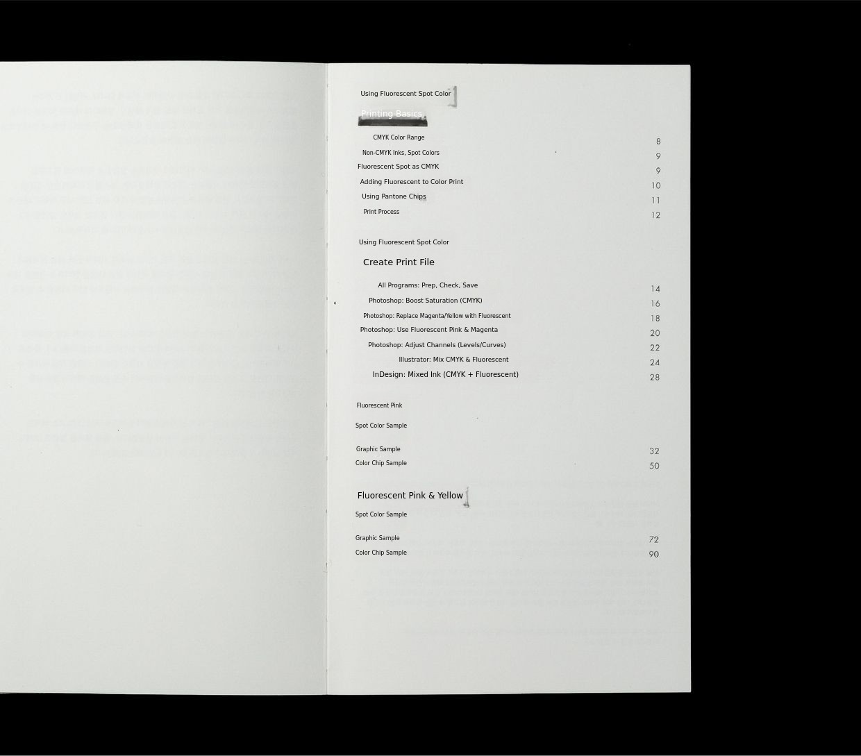
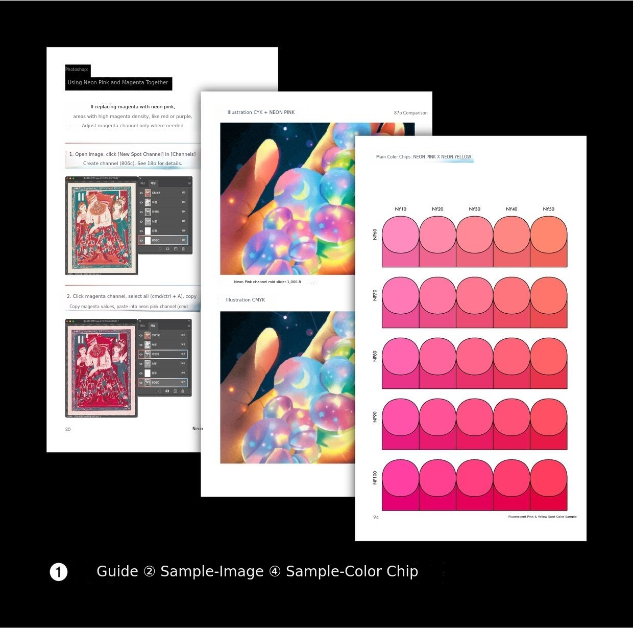
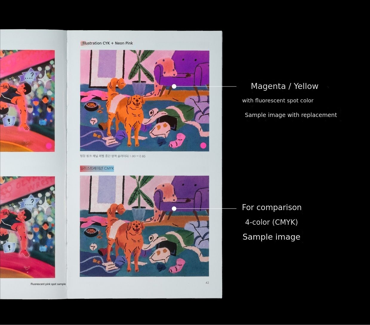
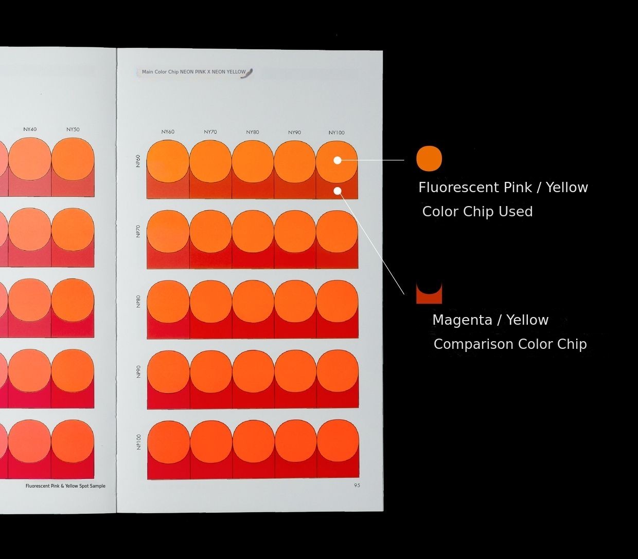
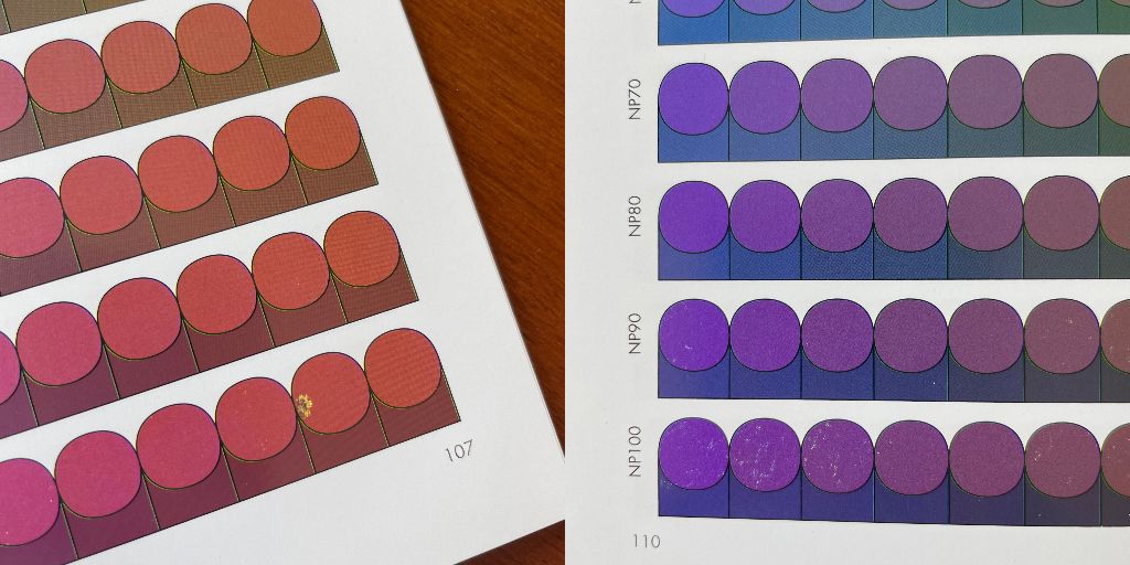
The sample section uses double-sided 12-color printing to show both CMYK results and those using neon spot colors. During this process, most books may have pages with misregistration or print tearing (speckling). We ask for your understanding.
3. The Meeting of Background Color and Foil Finishing"Color Foil Color SET"
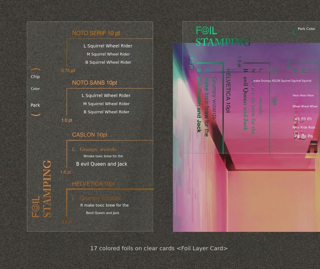
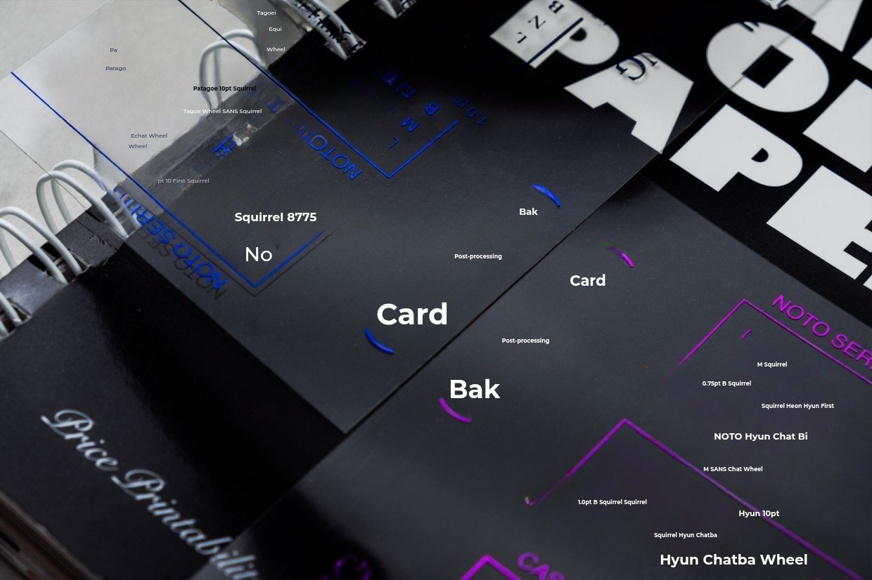
Would gold foil look better on a purple background, or would silver foil be better? Foil appears in different colors depending on how it reflects light, so it's difficult to accurately reproduce the real look on a monitor. Also, due to time and cost constraints, it's not easy to sample every foil color you're considering. This is when you need a sample book. Refer to "Color Foil Color," which shows excellent combinations of background colors and foils like a dictionary.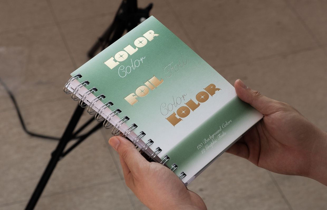
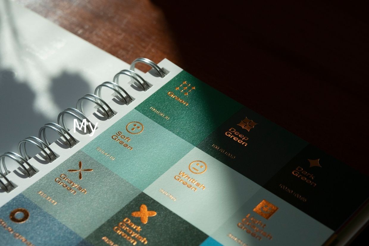
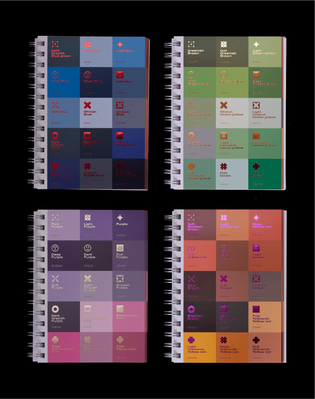
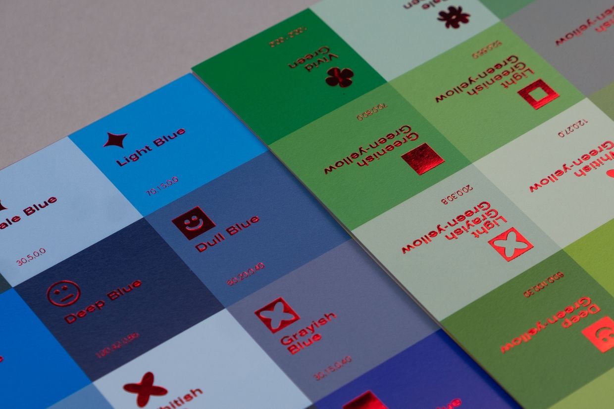
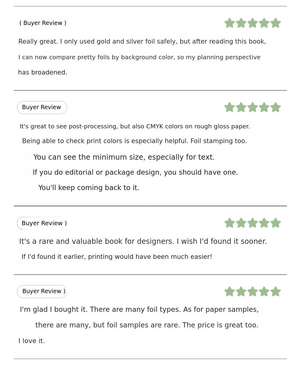
"Color Foil Color" is a sample book that contains combinations of 12 commonly used foils and 120 background colors, organized like a dictionary. As you flip through the pages, you can naturally check countless combinations of foils and background colors. It comes as a set with the "Foil Layer Card," a transparent card case that lets you try various foil finishes on your own designs.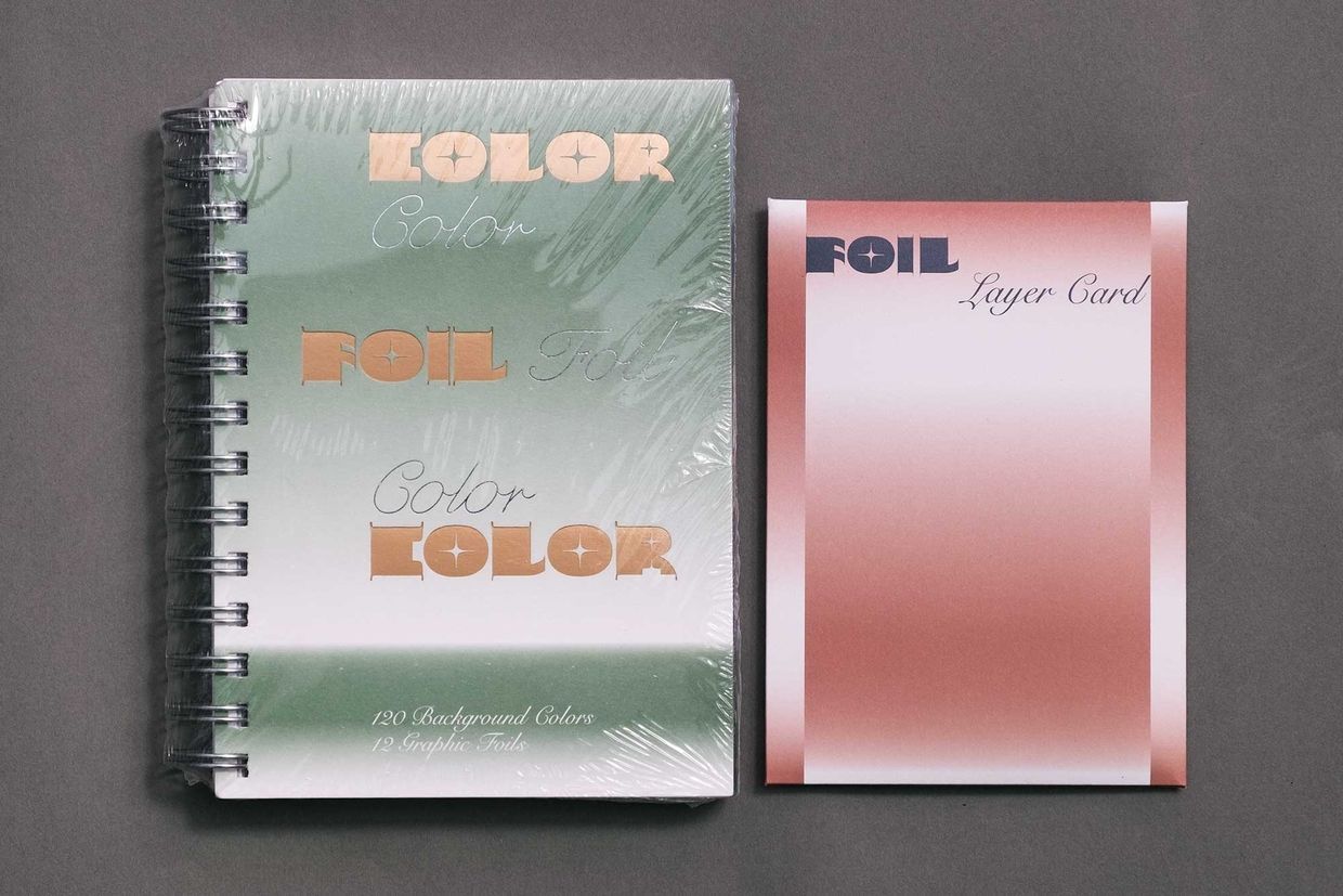
4. Texture sample book for printed materials"Face of Paper"
When producing printed materials, you sometimes get unexpected results. Matte coating can tone down highly saturated colors, making them look dull. On dark-colored Rendezvous paper, white bubbles from the coating can easily stand out. Conversely, prints with glossy coating have stronger, more vivid colors. You may also wonder how much better a paper that costs twice as much prints compared to similar types, or if there are more affordable yet decent options. This is when you need the texture sample book "Face of Paper."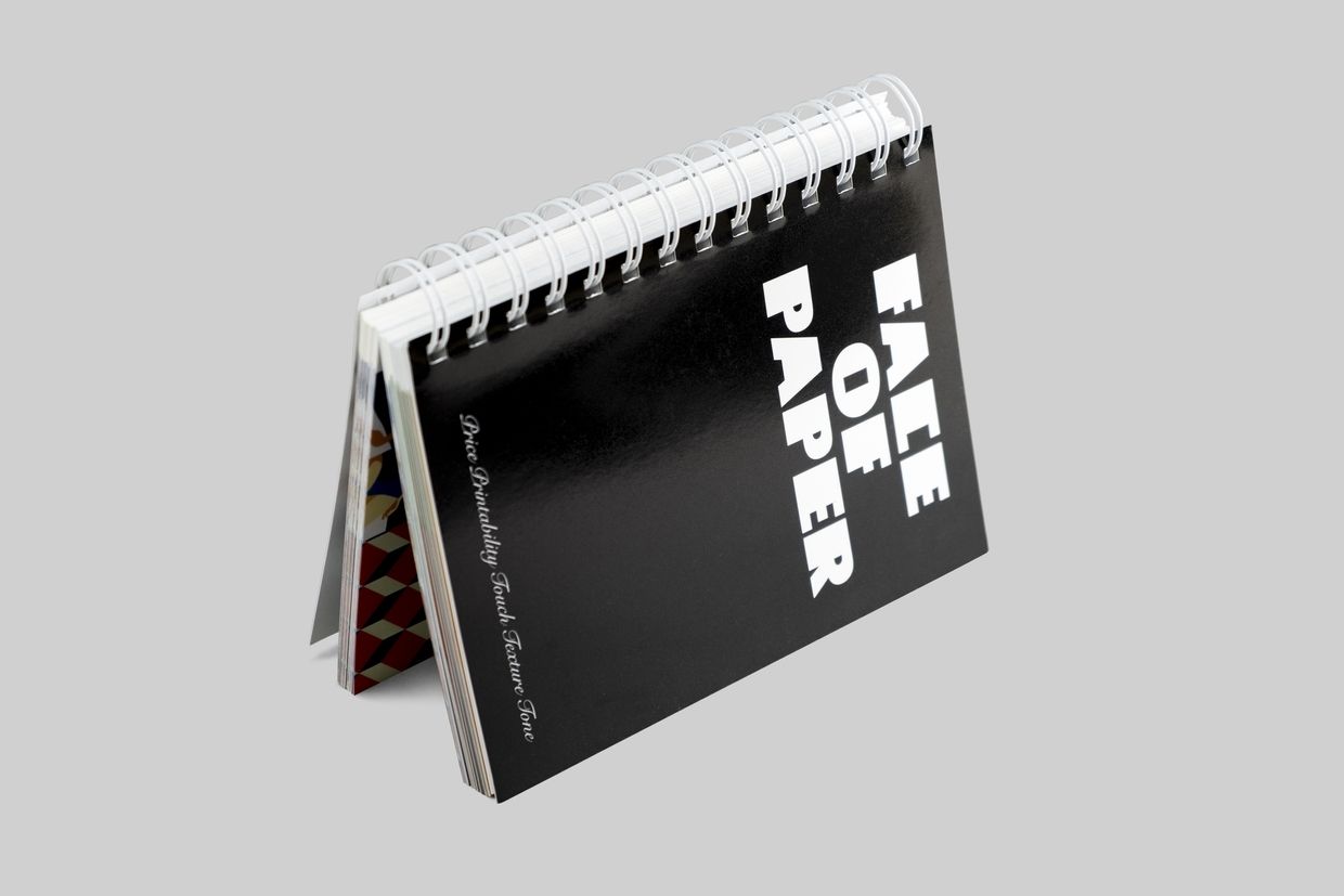
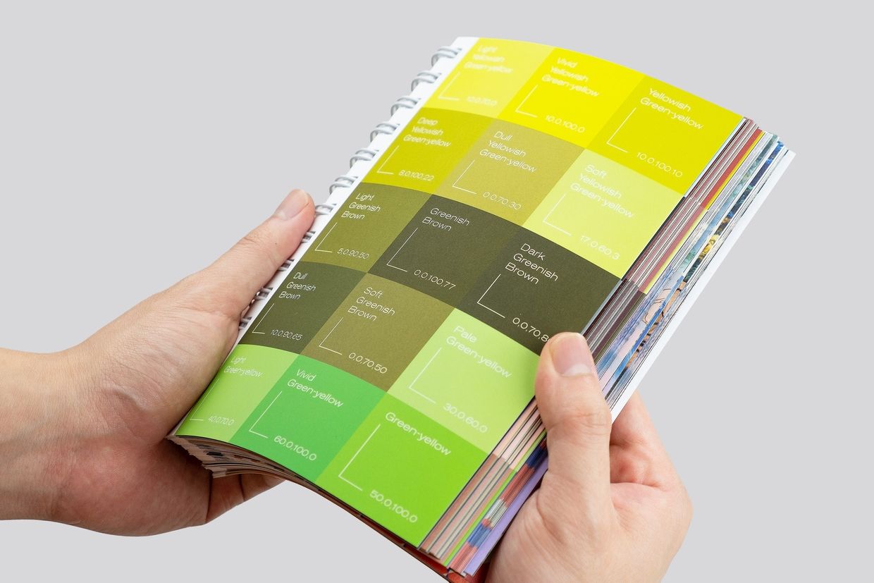
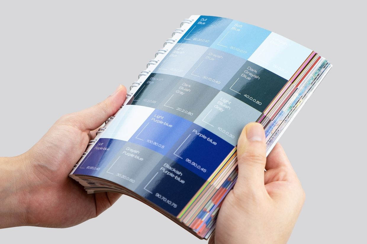
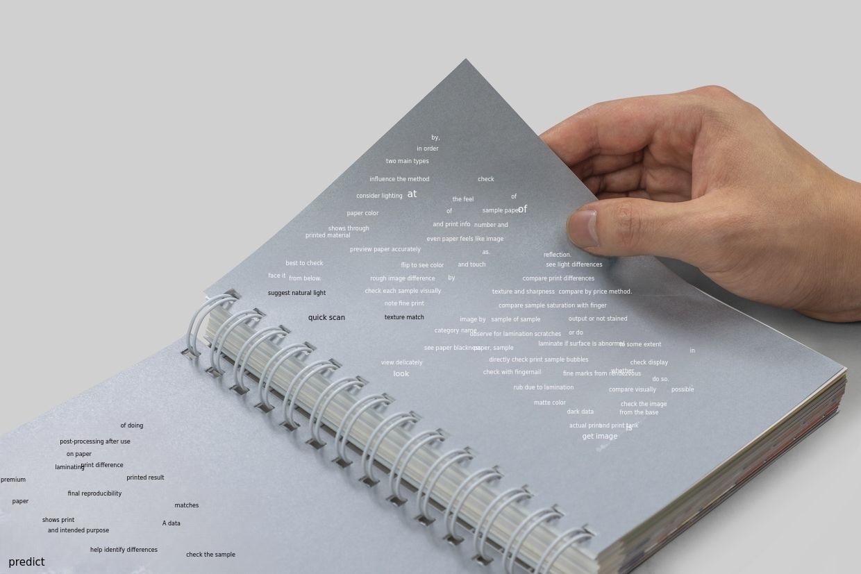
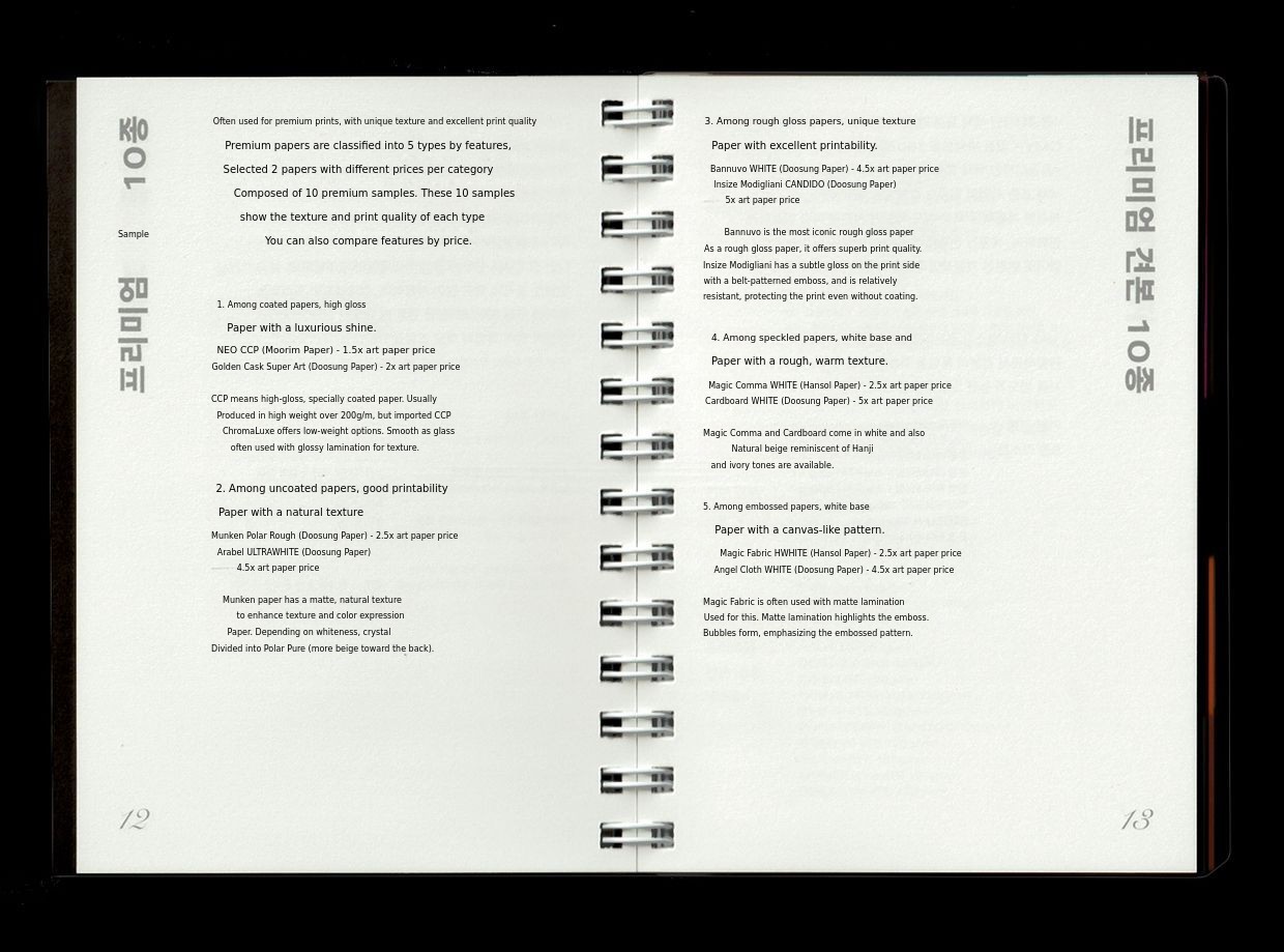
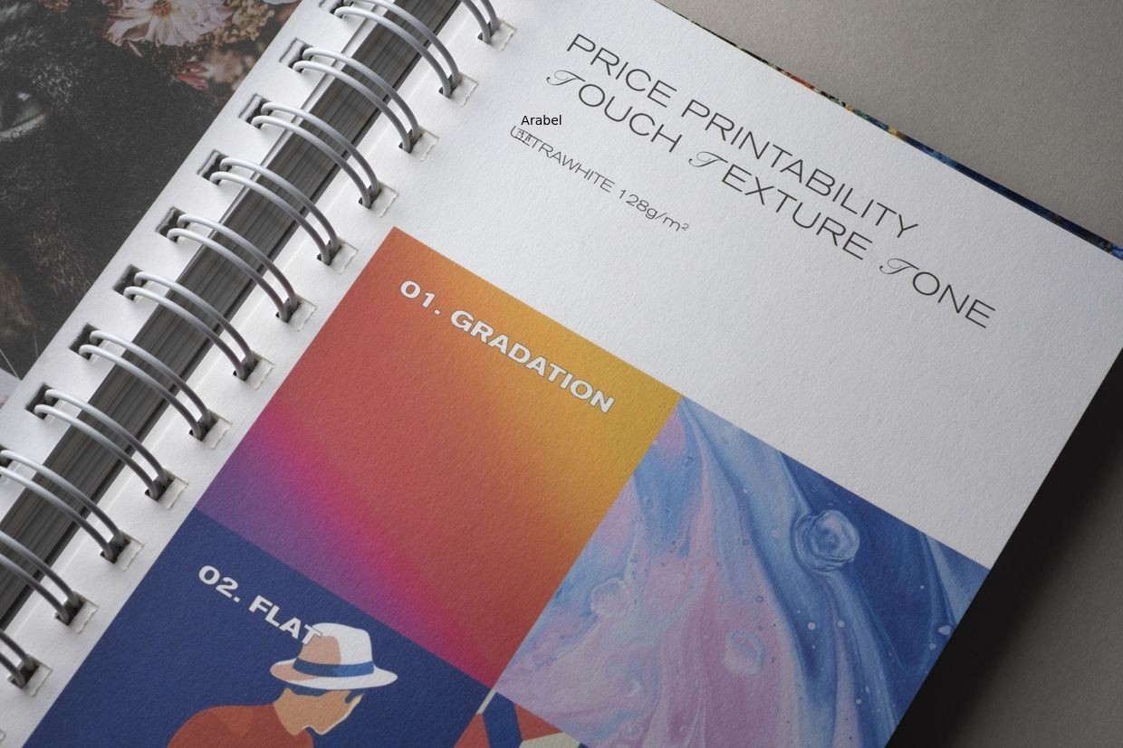
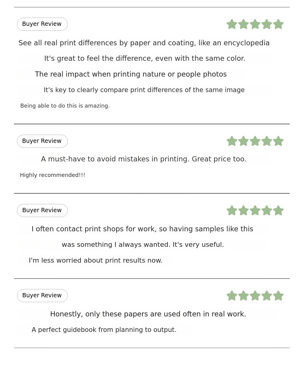
"Face of Paper" is a paper texture sample book that lets you see the differences in texture and color reproduction between 8 basic samples (basic papers and 3 types of coatings) commonly used for covers and various printed materials, and 10 premium paper samples with distinct characteristics and price differences. Rather than including every printable paper and finish, we selected samples that are widely used in the market, have clear characteristics by category, and vary in price range. With each page turn, you can observe distinct changes in color and texture.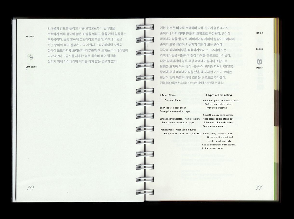
Reward composition
- Practical Guide to Expanding the Boundaries of Spot Colors: 33,800 KRW (Super Early Bird) / 34,800 KRW (Early Bird)

- Practical Guide to Expanding the Boundaries of Spot Colors ×1
- Small Quantity Spot Color Sample ×1
- Digital Sample Package ×1
- Spot Color Guide Series Set: 82,300 KRW (Super Early Bird) / 83,300 KRW (Early Bird)
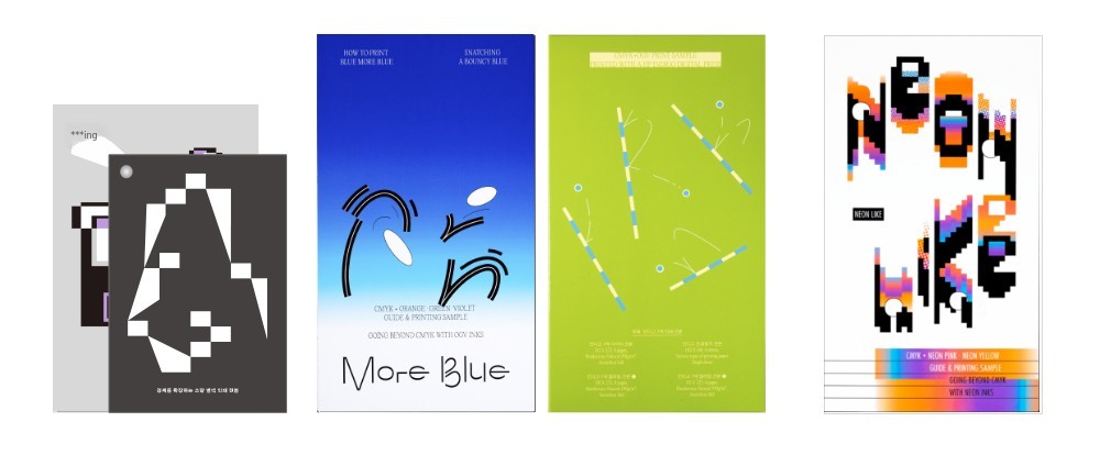
- Practical Guide to Expanding the Boundaries of Spot Colors ×1
- Small Quantity Spot Color Sample ×1
- Digital Sample Package ×1
- More Blue (7-Color Printing Guide, includes appendix/Indigo CMYK leaflet) ×1
- Neon Like (Fluorescent Printing Guide) ×1
- All Printing Guide Set: 159,700 KRW (Super Early Bird) / 160,700 KRW (Early Bird)
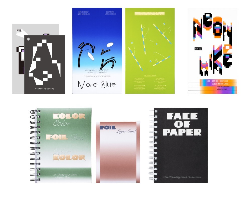
- Practical Guide to Expanding the Boundaries of Spot Colors ×1
- Small Quantity Spot Color Sample ×1
- Digital sample package ×1
- More Blue (7-color printing guide, includes appendix/Indigo CMYK leaflet) ×1
- Neon Like (fluorescent printing guide) ×1
- Color Foil Color SET (foil sample book) ×1
- Face of Paper (paper sample book) ×1
Digital file delivery method (applies to all rewards)
- Method: Google Drive
- Download period: Available for 30 days after project ends
Shipping fee is included.For remote islands/mountainous areas/Jeju Island, please select the additional shipping fee reward of 3,000 KRW and support accordingly. Thank you.
Don't see the configuration you want? You can select an additional reward to add books not included in the set.

Shipping information
- Shipped in box packaging via CJ Logistics.
- Delivery information for remote/mountainous areas: Supporters in these areas, please select the additional shipping fee when funding.
- Reward options/shipping address/payment information can be modified on the My Wadiz > Fund > Funding History page until the end of the funding period.
- If you need to change your shipping address after the funding ends, please contact the maker through the inquiry option on the relevant page.